DRD0198
New Member
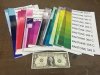
So my biggest issues lately, have been (seems Common) that Red looks Orange or that Blue is Purple. The computer screen looks great but the print looks way different (every preview sent to the customer says there is a slight color change to be expected) anyway. To my question I was browsing and seen another sign shop had this printout of color swatches seemed to be a very useful tool to show the colors that your printer prints and what it looks like laminated and finished, is this common how or where do I get something like that? Before I decided to spend hours building one I figured I would ask the more experienced. There was not a lesson on this in my Google and Youtube Certification Classes.