-
I want to thank all the members that have upgraded your accounts. I truly appreciate your support of the site monetarily. Supporting the site keeps this site up and running as a lot of work daily goes on behind the scenes. Click to Support Signs101 ...
Search results
-

Newbie Question: Avoiding a 'ridge' when layering vinyl
if i had to do that i would either a/ put a white outline on the black figure, weld to white o/l round text. This makes alignment very easy or b/ leave a 1 mil gap between black man & text - looks fine- striper14
- Post #18
- Forum: General Signmaking Topics
-
-

In need of some answers no hair left to pull.
gotta be calibration of one of your axes (?) If the curves out in the middle but not on the ends ( too big or too small ?) you need some fine adjustment to that axis. Try cutting a large circle from some scrap,say 300mm, & check the size. Only needs to be a mm or 2 out cheers- striper14
- Post #8
- Forum: Digital Printing
-
another cdr conversion
Thanks scuba steve, thats perfect...just a pity its such an ordinary logo...gotta play with what we're dealt though...thanks again..:U Rock:- striper14
- Post #3
- Forum: Clipart, Vehicle Templates and Digital Files
-
another cdr conversion
Hi, would someone be kind enough to convert this file to eps or pdf. Despite my client having 'worked for graphic designer', converting to curves & exporting as eps seems beyond her. thank you (file will only upload as txt so you need to rename)- striper14
- Thread
- Replies: 3
- Forum: Clipart, Vehicle Templates and Digital Files
-

Customer changes mind after approving proof and receiving banner.
i'd have thought any decent signwriter could have painted a quick drop shadow to smooth out any perceived bad kerning..and do it for free..:ROFLMAO:- striper14
- Post #35
- Forum: Designs & Layouts
-
Severe Bubbles on Layered Vinyl
I think the biggest trick with bubbles is not pressuring them before you prick them. Just prick the edge & give a tiny flick up with your knife ( i've had years of practise hehe) Ease air out & give hole a rub with back of fingernail to flatten vinyl. Repeat as necessary. Just be careful on...- striper14
- Post #20
- Forum: Installation Equipment & Techniques
-
Evening, any ideas?
looks like custom. The e's & r's are different. just grab a black marker pen & away you go !!- striper14
- Post #2
- Forum: Fonts and Typography
-

teaser
trying to id this font. Tried whatis & what the but only close. I've got more text & thinner to do so any help would be much appreciated tia- striper14
- Thread
- Replies: 0
- Forum: Fonts and Typography
-
I need help!
maybe your rollers slip a little bit. You'd only ever know when printing rulers anything else is near enough...just a thought -
Additional Adhesive for Vinyl
clear laminate works well. You can overlay the whole thing,extending 6mm or so , or just put little patches on the peeling bits. I've done both -
Did Avery strike again?
try peeling off the piece on the fuel flap to give you an idea how aggressive the adhesive is. If it hasn't got any grab then maybe the materials at fault. It shouldn't matter if its applied wet or not, once its dry it should stick. Avery metallics have always been crap IMO tho. See if... -

Ever see a wrap go this bad?
Sun damage. We get lots of it over here in sunny queensland. I did some 6" sllver stripes on a black suzuki swift on the hood,turret, bootlid etc & some company signs on the doors. The stripes were 3M Auto grade & the signs 5 year calendered. The car was never under cover. ( company cars never...- striper14
- Post #40
- Forum: Vehicle Wraps
-
-
Members of Signs101
probably a bit far away but I'd donate it to Fred...or maybe you could arrange a better viewing of GGs racks :ROFLMAO:- striper14
- Post #69
- Forum: General Signmaking Topics
-
A little font help please
Interesting..i ran your pic thru what font is yesterday & it came up blank. I just tried again & still no. How'd you manage to find it ?? cheers- striper14
- Post #3
- Forum: Fonts and Typography
-
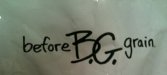
id needed please
thanks jill,..close but no cigar. The vmp one is gold rush but all the serifs are square not rounded. I've tried dafonts too. thanks for helping tho:thankyou:- striper14
- Post #3
- Forum: Fonts and Typography
-
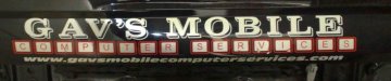
id needed please
need an id for the Gavs mobile. I can get close with Gold Mine, Gold rush etc but the base font is slightly different & the outlines thinner I think it might be a system font, maybe Gerber. Also the keyboard font would be nice, probably the same system. any help or insight would be much...- striper14
- Thread
- Replies: 4
- Forum: Fonts and Typography
-
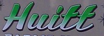
More Font help needed
Playbill Western is the font ur after- striper14
- Post #2
- Forum: Fonts and Typography
-
looking for designer
- striper14
- Post #13
- Forum: General Signmaking Topics
-
