-
I want to thank all the members that have upgraded your accounts. I truly appreciate your support of the site monetarily. Supporting the site keeps this site up and running as a lot of work daily goes on behind the scenes. Click to Support Signs101 ...
Search results
-
-
-
Restaurant Logo Assignment
That's another good job Rick.:cool1:- Service Sign Co
- Post #72
- Forum: Classroom Assignments
-
Gerber Graphix Advantage 6.0 blues
It's probably not compatible with a newer release of windows. The latest Omega 3 is worth the upgrade.- Service Sign Co
- Post #2
- Forum: Gerber
-
I need LXI Master 7.5!
They will only have 8.6 so you will need to upgrade. I would say that they are reasonable.- Service Sign Co
- Post #5
- Forum: General Software
-
Tennis Team Logo
I wouldn't print it just yet,spend a little more time with the design before you worry about the contour cut. I made a quick one too.- Service Sign Co
- Post #38
- Forum: Designs & Layouts
-
Atlantic Computer (fraud)
I agree with the Mosh Man too,other than the Dissociative identity disorder (DID) is a psychiatric diagnosis that describes a condition in which a person displays multiple distinct identities or personalities (known as alter egos or alters), each with its own pattern of perceiving and...- Service Sign Co
- Post #18
- Forum: Mutoh
-
Anybody know this font?
Nasalization http://new.myfonts.com/fonts/typodermic/nasalization/- Service Sign Co
- Post #5
- Forum: Fonts and Typography
-
?????
http://www.tubelite.com/locations.html I didn't see navy, just blue- Service Sign Co
- Post #4
- Forum: Materials
-
Restaurant Logo Assignment
I wanted to try another one that looked more along a logo style.- Service Sign Co
- Post #52
- Forum: Classroom Assignments
-
-

Making your own fonts
I scanned fonts from Signs of the Times,Atkinson sign painting & Speedball books and digitized them over 10 years ago, but they became cumbersome tying to use them without the proper kerning that Corel Draw would accommodate, There's no violation of copyright involved. Monks & Romans probably...- Service Sign Co
- Post #23
- Forum: Fonts and Typography
-
Making your own fonts
I don't know what it's called, My Fonts says "consult an expert" which i guess is me so Spurred Gothic should work- Service Sign Co
- Post #17
- Forum: Fonts and Typography
-

No clue
The only font I could find is LHF Milkman- Service Sign Co
- Post #7
- Forum: Fonts and Typography
-
Making your own fonts
That style looks good Pat, Here is one similar with lower case.- Service Sign Co
- Post #14
- Forum: Fonts and Typography
-
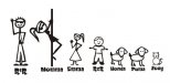
The kinds of jobs we get....
Mom on a stripper pole,that's hilarious.- Service Sign Co
- Post #5
- Forum: Designs & Layouts
-

Thoughts on this layout
I had to use this new letter style to see what it would look like- Service Sign Co
- Post #20
- Forum: Designs & Layouts
-
Thoughts on this layout
I would make it a little more traditional looking, not too much skews or proportions being that it is a permanent redwood sandblasted sign.- Service Sign Co
- Post #17
- Forum: Designs & Layouts
-
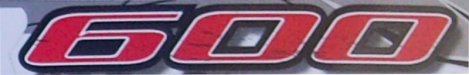
racey font
Serpentine should work, just squash it. I believe it is Serpentine sans. The only spur serif is the 6 so just delete a node http://www.itcfonts.com/fonts/detail.htm?pid=405988 Here's a link to it- Service Sign Co
- Post #5
- Forum: Fonts and Typography
-
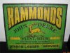
Another Vintage Sign
That looks great. Is that a computer generated pattern ,hand drawn pattern or a 1 shot deal? Just curious,because it looks like it could have been screen printed back in the day- Service Sign Co
- Post #13
- Forum: Portfolio Board
-