-
I want to thank all the members that have upgraded your accounts. I truly appreciate your support of the site monetarily. Supporting the site keeps this site up and running as a lot of work daily goes on behind the scenes. Click to Support Signs101 ...
Search results
-

Logo Concept
yeah, that's kind of the direction I was thinking. a rotten apple with a worm or snake (adam & eve reference) coming out or wrapped around it. I'd like to get a bike part or parts mixed in there somewhere.- nikdoobs
- Post #3
- Forum: Logo Design
-
-
Logo Concept
I have a group of friends who have started a bicycle club in New Orleans. Not like a health bicycle club... more of a get drunk,go bar hopping and do hood rat **** with your friends kind of club. We call ourselves the Bad Apples. I got a couple of logo ideas I'm sketching out but nothing I'm too...- nikdoobs
- Thread
- Replies: 14
- Forum: Logo Design
-

Logo for my hobby
I agree. I don't know much about calligraphy but aren't the vertical strokes usually heavier than the horizontal lines like you have? It bothers me that both of your w's are exactly the same (minus the a connector). No handwritten letters are exactly the same. Your new g looks much better.- nikdoobs
- Post #20
- Forum: Logo Design
-

New Logo... Critique?
We realize there are tons of successful businesses with misspelled words. This doesn't necessarily mean he should or should not do it. Dunkin' Donuts & Chick-Fil-A are informal colloquialisms. We don't have to write letters to anyone. It's just our opinion.- nikdoobs
- Post #45
- Forum: Logo Design
-
-
New Logo... Critique?
FWIW I think you should spell your name correctly. There are tons of name combinations you can make that have available domain names. Just checked go daddy, reatorsign.com is available for $10. There seems to be a trend going on with spelling your business name wrong. I guess some people think...- nikdoobs
- Post #36
- Forum: Logo Design
-
-

Logo for critique
- nikdoobs
- Post #14
- Forum: Logo Design
-
Concrete Images
http://www.coastalrepro.com/17-beautiful-sites-with-free-stock-photos/ Not sure if they have concrete images but I just came across this. also, http://www.sxc.hu is free- nikdoobs
- Post #3
- Forum: Clipart, Vehicle Templates and Digital Files
-
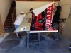
Shop upgrade!!
It really is. Your wrap install area looks pretty ideal. Send us more pics when you finish.- nikdoobs
- Post #6
- Forum: General Chit-Chat
-
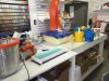
So it Begins!!!
looks like fun. Be sure to show us some finished pics- nikdoobs
- Post #4
- Forum: Portfolio Board
-
Favorite place for pre-made letters?
Gemini & http://www.dcsigns.com/ for channel Letters- nikdoobs
- Post #5
- Forum: Dimensional Signs
-
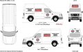
Looking for thoughts on locksmith van design
people are ******* stupid. I guess the 10 seconds when the door is open is extremely crucial. "Let's make the logo super small so it's hard to read all the time instead of making it easy to read 99.999% of the time.- nikdoobs
- Post #7
- Forum: Designs & Layouts
-
Looking for thoughts on locksmith van design
I'd make that logo as big as possible and get rid of all the residential/commercial jargon that doesn't accomplish much of anything except take up space.- nikdoobs
- Post #4
- Forum: Designs & Layouts
-
File not printing any like it should. Not CC issue.
Suzuki must have sent a bug to corrupt your file to prevent copyright infringement. -

Roller Derby Team Logo
Looks like an artichoke. ... just kidding it's badass.- nikdoobs
- Post #3
- Forum: Portfolio Board
-

Beer Label Design
This makes me want to try my hand at beer bottle design.- nikdoobs
- Post #32
- Forum: Designs & Layouts
-
Beer Label Design
I knew it wasn't an artichoke, I was just busting OP's chops. I'm just not that crazy about the bottom label. It looks good but I would have preferred a more minimalistic approach. You pulled off the simplistic wheat/football combo on the bottleneck nicely. I think that was all the football...- nikdoobs
- Post #27
- Forum: Designs & Layouts
-
Beer Label Design
I agree with others. The bottleneck and the type look great (Although the ball does look a little overinflated). While the image on the bottom looks cool, it doesn't really feel like it should go on a beer bottle. ...plus artichoke flavored beer seems kind of gross.- nikdoobs
- Post #7
- Forum: Designs & Layouts
-
Anyone set their laminator between 2 work tables?
yup. got two 5x10 tables and a laminator all on wheels.- nikdoobs
- Post #3
- Forum: Laminators