• I want to thank all the members that have upgraded your accounts. I truly appreciate your support of the site monetarily. Supporting the site keeps this site up and running as a lot of work daily goes on behind the scenes. Click to Support Signs101 ...

A Couple Lobby Posters & Flyers

jfiscus

Rap Master
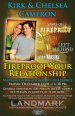
We did these for upcoming events at the boss' church.
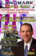
Let me know your thoughts. Finished product was 48" tall mounted to sintra(sp?) with matching flyers @ 11x17" to put at area businesses.

Logos created/recreated in Illustrator, layout designed in InDesign, exported as a PDF & placed directly into Versaworks.
 

Attachments

  • Cameron Event Poster.jpg
    Cameron Event Poster.jpg
    83.1 KB · Views: 165
  • Huckabee Poster.jpg
    Huckabee Poster.jpg
    89.3 KB · Views: 153

joeshaul

New Member
I like both designs, I think the Fireproof one is the better design of the two as far as colors/contrast/etc.

As for improvements, I can only recommend a few minor tweaks:
You may want to remove the text below the "Fireproof" movie logo though, as it's really hard to read against that background.

The Huckabee design's flag look a little bit pinkish to me, dunno if it's my monitor, but a lot of people take those colors very seriously!
 

jfiscus

Rap Master
I like both designs, I think the Fireproof one is the better design of the two as far as colors/contrast/etc.

As for improvements, I can only recommend a few minor tweaks:
You may want to remove the text below the "Fireproof" movie logo though, as it's really hard to read against that background.

The Huckabee design's flag look a little bit pinkish to me, dunno if it's my monitor, but a lot of people take those colors very seriously!

I would have removed that text, but left it as it was how I was sent their "official logo", the flag did end up pinkish in parts but other areas were bright & vivid; sometimes those transparency effects can do some odd results.

thx guys for the compliments & suggestions; I also agree about it being busy, but they want a bunch of info on everything, as we use the same art on the handouts for people completely unfamiliar with the venue, etc.
 

Doyle

New Member
I didn't even read them because they were too busy, no rhythm, just a bunch of words typed out on a busy background.... also don't really like the choices of color
 

Flame

New Member
I didn't even read them because they were too busy, no rhythm, just a bunch of words typed out on a busy background.... also don't really like the choices of color


Yeah sorry. Nothing got me too excited, just another cluttered layout.
 

Letterbox Mike

New Member
I'd be very careful with that Huckabee one, that flag is bound to offend some people. I'd definately go back to the drawing board on that one.
 
Top