Rodi
New Member
Designed some amazing fonts.
Any discerning artist would do well to look more at the library of his work. I am regularly stunned at the variety and quality of his work. I love one, then I love the next even better, right now Aribiter BQ is my favorite.
Landi Linear (1942). This was revived in digital form in 2011 by toto as K22 Landi Linear.
Etruria (1940-42)
Express (1940-43)
Normandia (1946-49, with Butti, and 1952)
Athenaeum Initials (with A. Butti, 1945-1947)
Fluidum (+Bold) (1951, script). Revived by Ralph Unger as Butti (2011).
Fontanesi (1951-54, a rococo font)
Microgramma (1952, with A. Butti; available at URW++). This was done as an alternative to Bank Gothic, and is identical to Eurostile Bold Extended.
Nova Augustea (1951, ITC Augustea Open)
Egizio (1953-57), a slab serif [see E710 Roman on the SoftMaker MegaFont XXL CD, 2002, or Egizio URW (2009, quite complete family with 5 styles) or Egizio EF (2001)]. For a specimen, see here.
Cigno (1954). This script face was revived an extended as P22 Cigno (2008, Colin Kahn, P22).
Swan (1954), aka Cigogna (with A. Butti).
Juliet (1954-55). For a superb revival and extension, see Canada Type's Ambassador Script (2007).
Ritmo (1955)
Rhythm (1955)
Garaldus (1956-ff)
Slogan (1957). Digital revival by Terry Wudenbachs in 2010 called P22 Slogan.
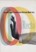
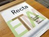
Recta (1958-1961). This is a large sans family. Canada Type published an 18-font revival in 2011, also called Recta.
Estro (1961)
Fancy (1961)
Exempla (1961)
the Eurostile family (1952: caps, with Alessandro Butti; 1962: lower case) (Adobe, Linotype, URW++ have it)
Patrizia
Magister (1966)
Forma (1966)
Oscar (1966)
Lambert (Compacta lookalike)
Exempla (VGC, 1966, Third Prize in the 1966 VGC National Type Face Design Competition)
Metropol (1967). This was digitized by Patrick Griffin at Canada Type in 2007 as Press Gothic. Originally, it was meant as an alternative to Geoffrey Lee's Impact at Stephenson Blake.
Elite (1968, a boring linear script, digitized in 2005 by Canada Type as Fontella)
Fenice
Stop (1971; available at Linotype, URW++, Elsner&Flake)
Dattilo (1974, an Egyptian face) (1974): his last creature for Nebiolo, a typewriter type.
His post-Nebiolo fonts:
Sintex 1 (VGC, 1973). A revival and expansion of this funky nightclub face was done in 2008 by Patrick Griffin at Canada Type as Stretto.
Bloc (1974, VGC)
Mixage (1977 Haas, a lineal font, now ITC Mixage) 1985?
Novarese Book (1978, now ITC Novarese Book)
Lapidar (1977)
Andromeda (1978, VGC)
Global (1978, VGC)
Fenice (1977-80; now ITC Fenice)
Expert (1983)
Colossal (1984); see Colossalis at Berthold, a slab serif sports lettering family)
Symbol (1982-1984, now ITC Symbol)
Arbiter (1989, Berthold)
Any discerning artist would do well to look more at the library of his work. I am regularly stunned at the variety and quality of his work. I love one, then I love the next even better, right now Aribiter BQ is my favorite.
Landi Linear (1942). This was revived in digital form in 2011 by toto as K22 Landi Linear.
Etruria (1940-42)
Express (1940-43)
Normandia (1946-49, with Butti, and 1952)
Athenaeum Initials (with A. Butti, 1945-1947)
Fluidum (+Bold) (1951, script). Revived by Ralph Unger as Butti (2011).
Fontanesi (1951-54, a rococo font)
Microgramma (1952, with A. Butti; available at URW++). This was done as an alternative to Bank Gothic, and is identical to Eurostile Bold Extended.
Nova Augustea (1951, ITC Augustea Open)
Egizio (1953-57), a slab serif [see E710 Roman on the SoftMaker MegaFont XXL CD, 2002, or Egizio URW (2009, quite complete family with 5 styles) or Egizio EF (2001)]. For a specimen, see here.
Cigno (1954). This script face was revived an extended as P22 Cigno (2008, Colin Kahn, P22).
Swan (1954), aka Cigogna (with A. Butti).
Juliet (1954-55). For a superb revival and extension, see Canada Type's Ambassador Script (2007).
Ritmo (1955)
Rhythm (1955)
Garaldus (1956-ff)
Slogan (1957). Digital revival by Terry Wudenbachs in 2010 called P22 Slogan.
Recta (1958-1961). This is a large sans family. Canada Type published an 18-font revival in 2011, also called Recta.
Estro (1961)
Fancy (1961)
Exempla (1961)
the Eurostile family (1952: caps, with Alessandro Butti; 1962: lower case) (Adobe, Linotype, URW++ have it)
Patrizia
Magister (1966)
Forma (1966)
Oscar (1966)
Lambert (Compacta lookalike)
Exempla (VGC, 1966, Third Prize in the 1966 VGC National Type Face Design Competition)
Metropol (1967). This was digitized by Patrick Griffin at Canada Type in 2007 as Press Gothic. Originally, it was meant as an alternative to Geoffrey Lee's Impact at Stephenson Blake.
Elite (1968, a boring linear script, digitized in 2005 by Canada Type as Fontella)
Fenice
Stop (1971; available at Linotype, URW++, Elsner&Flake)
Dattilo (1974, an Egyptian face) (1974): his last creature for Nebiolo, a typewriter type.
His post-Nebiolo fonts:
Sintex 1 (VGC, 1973). A revival and expansion of this funky nightclub face was done in 2008 by Patrick Griffin at Canada Type as Stretto.
Bloc (1974, VGC)
Mixage (1977 Haas, a lineal font, now ITC Mixage) 1985?
Novarese Book (1978, now ITC Novarese Book)
Lapidar (1977)
Andromeda (1978, VGC)
Global (1978, VGC)
Fenice (1977-80; now ITC Fenice)
Expert (1983)
Colossal (1984); see Colossalis at Berthold, a slab serif sports lettering family)
Symbol (1982-1984, now ITC Symbol)
Arbiter (1989, Berthold)


")