• I want to thank all the members that have upgraded your accounts. I truly appreciate your support of the site monetarily. Supporting the site keeps this site up and running as a lot of work daily goes on behind the scenes. Click to Support Signs101 ...

Can I get some input on this please?

Moze

Precision Sign Services
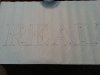
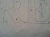
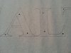
I'm not a font expert (obviously), but I know spacing between letters isn't always exactly the same from letter to letter.

The attached photos show the bottom serifs of the 'R' and the 'E' closer together than the 'A' and the 'L'.

Is this an error or is that just how this font is supposed to be?
 

Attachments

  • 02.jpg
    02.jpg
    90.8 KB · Views: 142
  • 03.jpg
    03.jpg
    80.1 KB · Views: 108
  • 04.jpg
    04.jpg
    83.8 KB · Views: 116

J Hill Designs

New Member
its more about the 'visual feel' than the exact measurement between serifs.

The RA is closer because the R opens up to the a

the AL is farther because the L stops the eye dead

seems the EA is a little loose is my input
 

Moze

Precision Sign Services
its more about the 'visual feel' than the exact measurement between serifs.

The RA is closer because the R opens up to the a

the AL is farther because the L stops the eye dead

seems the EA is a little loose is my input


I assume you meant the 'R' and 'E'...?

Anyway, I get what you're saying. And I agree, it looks like the 'E' and 'A' should be closer.


That looks more accurate to me.
 

SignosaurusRex

Active Member
For this particular type face and these four characters in that order, I think that the space between characters at the base line should be nearly equal to one another.
 

Moze

Precision Sign Services
Thank you for all of the responses.

My assumption was that when the wording was laid out in whatever program, you just typed out what you wanted and they were automatically spaced. Is that not how it works?
 

John Butto

New Member
Thank you for all of the responses.

My assumption was that when the wording was laid out in whatever program, you just typed out what you wanted and they were automatically spaced. Is that not how it works?

When I typed it out it came out just like your pattern. So that is how it works.
 

Rick

Certified Enneadecagon Designer
Thank you for all of the responses.

My assumption was that when the wording was laid out in whatever program, you just typed out what you wanted and they were automatically spaced. Is that not how it works?

When you say automatically, it will only space how pairs were programed to space
by whatever software you are using, or how the type designer spaced them...

You either have to manually kern them, or some programs like Illustrator for instance
has an option where you can "Optically" space them from your "Character" window.

You still might have to adjust here and there, but it gets pretty close.
 

ddubia

New Member
Auto kerning gets them close. But like everything else, if you enlarge something the mistakes get bigger too. Auto kerning works ok for the most part at a small size. But when enlarged, as in the letters for a sign, those small inconsistencies get bigger and easier to notice.

Just my 2 cents.
 
Top