-
I want to thank all the members that have upgraded your accounts. I truly appreciate your support of the site monetarily. Supporting the site keeps this site up and running as a lot of work daily goes on behind the scenes. Click to Support Signs101 ...
You are using an out of date browser. It may not display this or other websites correctly.
You should upgrade or use an alternative browser.
You should upgrade or use an alternative browser.
CMYK to PMS
- Thread starter scottfree13
- Start date

scottfree13
Scottfree Graphics
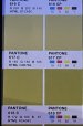
Thank you but I am still unaware of which one is the Pantone. 
Johnny Best
Active Member
2291C or 2292C are close, C stands for coated.
Boudica
I'm here for Educational Purposes
the whole bottom row are pantone colors.

Graphic Extremes
Knows To Little
What color converter is this.
DarkerKat
design & such
Just to add some confusion, PMS 2304C is Illustrator's best match (color build is C:32 M:6 Y: 77 K:12 - so you're trading mostly magenta for black)
+the build listed above for PMS618 is incorrect, actual build for that is C:19 M:16 Y:91 K:28 (per the PMS color bridge book)
I don't put a lot of stock in those online converters, you're going to get a different answer everywhere you go... If you have a swatch book handy, I would look at the suggestions made in this thread and just pick one/let the client pick one.
DarkerKat
design & such
they're using Ginifab CMYK converterWhat color converter is this.
there is also this one Dns CMYK converter
Graphic Extremes
Knows To Little
I use the Pantone Bridge Color books also, they seem to get closer on the color, but sometimes they are totally off from what you think you will get from the coated books and you compare it to the bridge book comparison.
myront
Dammit, make it faster!!
and more confusion.Just to add some confusion, PMS 2304C is Illustrator's best match (color build is C:32 M:6 Y: 77 K:12 - so you're trading mostly magenta for black)
+the build listed above for PMS618 is incorrect, actual build for that is C:19 M:16 Y:91 K:28 (per the PMS color bridge book)
I don't put a lot of stock in those online converters, you're going to get a different answer everywhere you go... If you have a swatch book handy, I would look at the suggestions made in this thread and just pick one/let the client pick one.


DarkerKat
design & such
and more confusion.
Yeah that seems about right... how else will they keep us buying their stuff?
Oh Pantone, why are you the worst?
A CMYK color specification without a color space profile(like US Web Coated Swap V2) is MEANINGLESS.
You are playing color roulette/pin the tail on the donkey when you try to specify color this way.
Using Pantone swatches to visually match is the same game.
Measure the color you want with a spectro like an i1 or Nix to get the L*a*b* specification.
Create a L*a*b* named swatch in your design program and/or RIP program based on this measurement.
You will have the actual color specified and then it is ultimately about whether the ink, paper, and illumination condition will
allow the color to be well reproduced.
The book Real World Color Management can be helpful in understanding things like this. www.projectbbcg.guide is also good.
DarkerKat
design & such
I mean... Yeah, you're right, but the OP is working from CMYK. What exactly is your suggestion here, they go buy a 1200$ tool and hold it up to the computer screen?A CMYK color specification without a color space profile(like US Web Coated Swap V2) is MEANINGLESS.
You are playing color roulette/pin the tail on the donkey when you try to specify color this way.
Using Pantone swatches to visually match is the same game.
Measure the color you want with a spectro like an i1 or Nix to get the L*a*b* specification.
Create a L*a*b* named swatch in your design program and/or RIP program based on this measurement.
You will have the actual color specified and then it is ultimately about whether the ink, paper, and illumination condition will
allow the color to be well reproduced.
The book Real World Color Management can be helpful in understanding things like this. www.projectbbcg.guide is also good.
Using a spectrometer and lab values is the right way to go about it, but the job still has to get produced?
I actually do think that people doing color work should own an accurate spectrophotometerI mean... Yeah, you're right, but the OP is working from CMYK. What exactly is your suggestion here, they go buy a 1200$ tool and hold it up to the computer screen?
Using a spectrometer and lab values is the right way to go about it, but the job still has to get produced?
that they can afford. I certainly would not tell them to hold it up to their computer screen.
Even so, the real issue at base is that many people who use CMYK for a color specification
don't know that CMYK is a device dependent color specification that needs
a color space profile to give it meaning. If you have CMYK and a color space
profile, you can convert it to L*a*b* with something like http://colormine.org/color-converter
which has a CMYK to lab converter that has many of the common CMYK color space profiles
that are in use today. Someone can take a converter like this, and then see what works based
on trying each of the available color space profiles with the CMYK they are working with. There
are also ways in Adobe, Affinity, and RIP software to cycle through the CMYK color space profiles
to get a visual rendition- provided the monitor being used has been properly calibrated and profiled.
I am concerned about the common acceptance of using CMYK without some kind of
color space profile to give meaning to the CMYK numbers. With Pantones in particular,
I can tell you that Pantone-provided sRGB numbers(based on the sRGB color space profile)
always converted to Pantone's L*a*b* for the swatch someone wanted. Pantone NEVER specified a color space
profile for their CMYK numbers. They could have set a better example, but chose not to. My
comments on Pantone are based on my experience of the Pantone Color Manager software,
which was discontinued in favor of Pantone Connect.
I should have mentioned the color converter and software approaches in my original message
to be more effectively responsive- thank you for your message.
JBurton
Signtologist

Wild. This is an admittedly old book. Also, what does CP stand for on yours?
Boudica
I'm here for Educational Purposes
Pantone Connect?Also, what does CP stand for on yours?
DarkerKat
design & such
CP is Coated Process (CYMK builds of approximate Pantone colors) - PC (Process Simulation Coated Paper ) was discontinued around 2010Wild. This is an admittedly old book. Also, what does CP stand for on yours?
(basically they just renamed it when the color bridge was overhawled)
Graphic Extremes
Knows To Little
Graphic Extremes
Knows To Little
I actually do think that people doing color work should own an accurate spectrophotometer
that they can afford. I certainly would not tell them to hold it up to their computer screen.
Even so, the real issue at base is that many people who use CMYK for a color specification
don't know that CMYK is a device dependent color specification that needs
a color space profile to give it meaning. If you have CMYK and a color space
profile, you can convert it to L*a*b* with something like http://colormine.org/color-converter
which has a CMYK to lab converter that has many of the common CMYK color space profiles
that are in use today. Someone can take a converter like this, and then see what works based
on trying each of the available color space profiles with the CMYK they are working with. There
are also ways in Adobe, Affinity, and RIP software to cycle through the CMYK color space profiles
to get a visual rendition- provided the monitor being used has been properly calibrated and profiled.
I am concerned about the common acceptance of using CMYK without some kind of
color space profile to give meaning to the CMYK numbers. With Pantones in particular,
I can tell you that Pantone-provided sRGB numbers(based on the sRGB color space profile)
always converted to Pantone's L*a*b* for the swatch someone wanted. Pantone NEVER specified a color space
profile for their CMYK numbers. They could have set a better example, but chose not to. My
comments on Pantone are based on my experience of the Pantone Color Manager software,
which was discontinued in favor of Pantone Connect.
I should have mentioned the color converter and software approaches in my original message
to be more effectively responsive- thank you for your message.
One thing I have noticed is that in Illustrator you can not set lab values with decimal points, all numbers are rounded one way or the other,or am I missing a setting somewhere