• I want to thank all the members that have upgraded your accounts. I truly appreciate your support of the site monetarily. Supporting the site keeps this site up and running as a lot of work daily goes on behind the scenes. Click to Support Signs101 ...

Color consistency between SP-540v & VP-540

jsalda

New Member
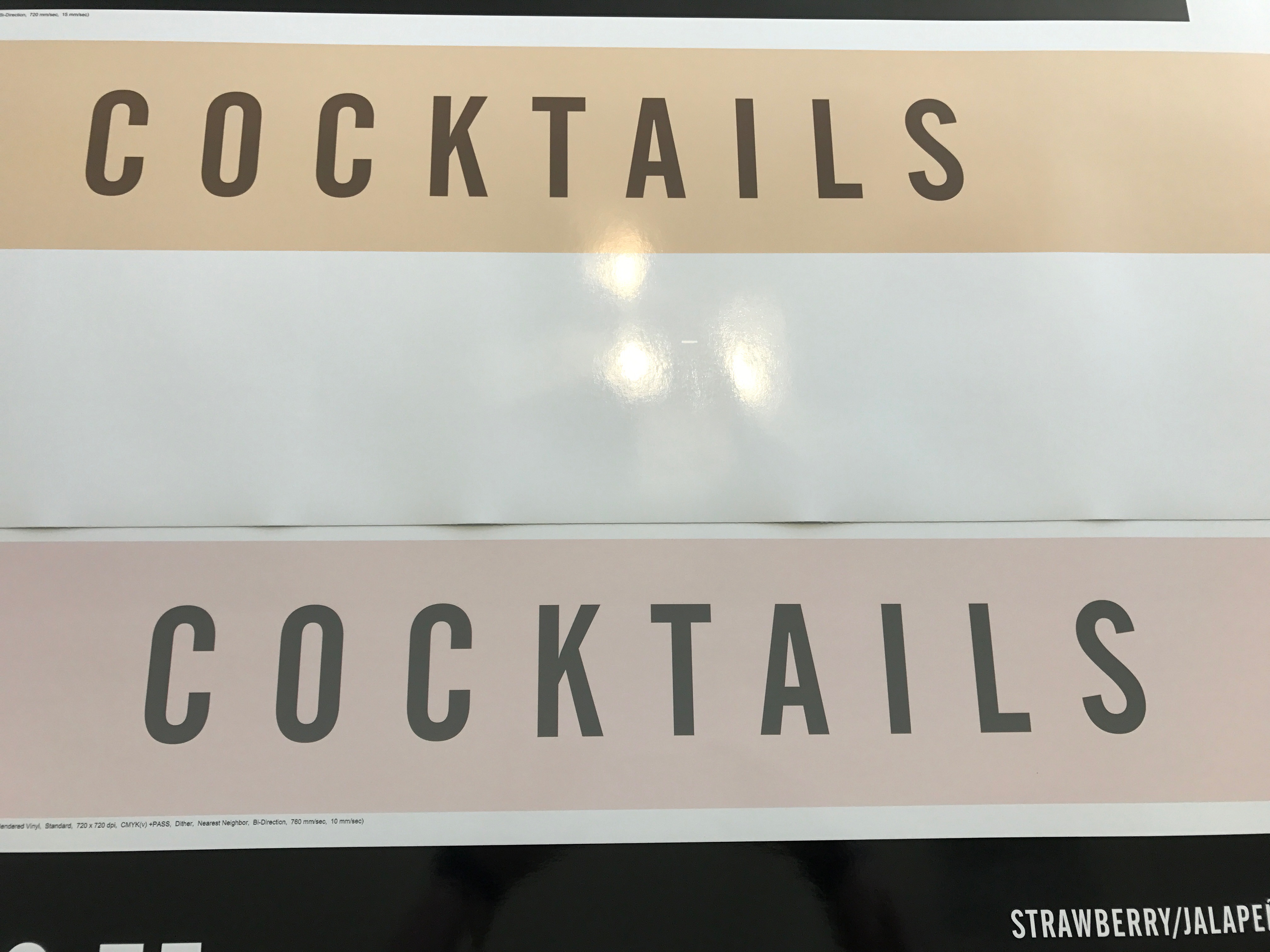
I know the long, involved answer to this is to create custom profiles for each machine. However, currently, I'm looking to just try and get close color between our SP-540v & VP-540. The VP tends to lean heavily towards the magenta. I've attached a picture for reference. Exact same file, same roll of material and using the Roland Glossy Calendared profile for each respective printer. The SP print in on the top and accurate to the screen in Illustrator and the CMYK mix. The VP on the bottom is way off and pink. Running both machines off of the same Versaworks, all settings are consistent in VW and using the same inks for both. Again, I'm not looking for perfection, but it would be nice to not be able to see a difference between the two unless they were right next to each other. These can be opposite ends of the room and you can see it.

IMG_0689.jpg
 

Triggerhappy

New Member
at first look what stands out is, that it is not the same profile. On the one made with the VP you have the +pass profile, wich means it is using the intelligent pass controle (RIPC), while the SP does not have any profile with the extra pass. Other thing that may cause color inconsistency is the heating. It sound strange but it does effect colors. hope it helps
 

Pauly

Printrade.com.au
It's possible that one of the profiles aren't as accurate as the other.
There should be a way in your rip to see the ink mixtures of what the printer will print for specific colours in the image.
Inside onyx i can get the eye droplet tool and just scan over the image and it'll tell me the CMYK value the printer will put down to achieve the colour. Of corse its different for every profile. (similar to photoshop picking a colour from the image, except this is after converting the image to the printers profile)
If you can do that. compare one with the other. If they are similar. It's the printer. If they're not similar, it's the profiles.

If its the profiles, Well then you're going to need to get some custom ones.
 
Hey jsalda,

Generally to improve color accuracy (including greys and prints from two different printers), please change the VersaWorks Color Management setting to help with this issue. To access that option, launch VersaWorks, click on “Edit > Queue A Settings”. In the window that appears, click on the “Quality” button, and look at the Color Management drop down list of options. Click on “Density Control Only” and finally, click the “OK” button to save the change. Print the job again.

Also, be sure the artwork is saved as an RGB color images, not CMYK. If saved as CMYK, the desired colors will not print correctly.

Additionally, we have another training session that deals with all the settings under the VersaWorks “Quality” tab can be viewed here:
. This video is very, very informative and I’m sure it will help.

Finally, we discuss using the Roland spot color matching system to get predicable color from the printer. This process is demonstrated in the training video here:
.

We understand this is a lot of info, but it’s all that we have to address the issue(s) you’re experiencing. If the above does not help you, it’s time to get your dealer onsite to assists with this process/workflow (and to inspect the printer to be sure it’s working correctly).

Take care,

Roland Technical Support
Roland DGA Corp.
rn
 

jsalda

New Member
Thanks to all for the suggestions and info. I've been playing a bit with the curves on the VP to get it close for now. Looking at getting an X-Rite from another member soon and building custom profiles so that we'll be a lot closer.
 
Top