James Burke
Being a grandpa is more fun than working
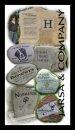
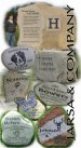
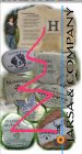
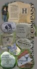
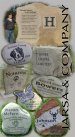
I needed something quick for a trade show this weekend. It goes behind a 4' x 4' floor display and it will eventually hang in our booth at a craft mall. I've done a few things with Photoshop for our brochure, but this one was a little more fun...even throughout the initial learning curve of layer masks, etc... (I just downloaded CS5 this weekend).
Overall measurements 46" x 72". Our contact information is on some of our other marketing materials (and is also engraved on stones) on the floor display.
JB
Overall measurements 46" x 72". Our contact information is on some of our other marketing materials (and is also engraved on stones) on the floor display.
JB
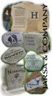
") Really showcases what you do.
Really showcases what you do.