Hi there,
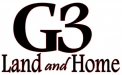
I've been going through my font collection and slightly out of my mind trying to match the stuff that is in the attached sample. ITC Veljovic is the nearest thing I've been able to find to fit this. But Veljovic is not the correct typeface. Some of the details of the characters are just off. Complicating things further, the original "artist" obviously distorted some of the type and likely thickened the letters artificially.
Any help would be appreciated. Thanks in advance.