-
I want to thank all the members that have upgraded your accounts. I truly appreciate your support of the site monetarily. Supporting the site keeps this site up and running as a lot of work daily goes on behind the scenes. Click to Support Signs101 ...
You are using an out of date browser. It may not display this or other websites correctly.
You should upgrade or use an alternative browser.
You should upgrade or use an alternative browser.
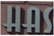
Font Please
- Thread starter dlndesign
- Start date
Sign to Go
New Member
Looks Like Asiaextended Or Anna
Jim
Jim
oldgoatroper
Roper of Goats. Old ones.
Looks like Anna is the same font...
J Hill Designs
New Member
looks the same as ddarlak's logo in http://www.signs101.com/forums/showthread.php?threadid=56120 this thread...maybe ask him?
njsigns
New Member
Looks like Anna is the same font...
The main difference I see (besides the obvious "lights" running across the top and bottom) is $29...
Gene
RebeckaR
New Member
http://www.abstractfonts.com/font/528
Perhaps Anastasia?
Perhaps Anastasia?