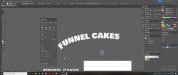
Hey all, I have a client looking for a specific look for their font in a project we are doing but I cant seem to figure out how its accomplished. It seems to look 3d yet its from a straight on perspective so I am not sure how they accomplished it. I know the font used (or at least I am 99% sure) is Passion One. Can anyone help point me in the right direction to accomplish this look. The attached picture isn't the best but I think its good enough to show what I mean. Its what the client found and would like to use the same style. Maybe it was done in Photoshop and brought into Illy, not really sure. Thanks for any and all help.
-
I want to thank all the members that have upgraded your accounts. I truly appreciate your support of the site monetarily. Supporting the site keeps this site up and running as a lot of work daily goes on behind the scenes. Click to Support Signs101 ...
You are using an out of date browser. It may not display this or other websites correctly.
You should upgrade or use an alternative browser.
You should upgrade or use an alternative browser.
Help with a font look in illustrator
- Thread starter crny1
- Start date

Actually the typeface in question looks more like a condensed weight of Motter Corpus, not Passion One. Anyway, the effects on the lettering can be accomplished using a combination of the Path Offset command for the outline effects and inner bevel for the shading functions. Take your pick on whether to do that using Illustrator or Photoshop (and pasting/clipping a raster image using the latter method). Also, for the arc text swoop thing, rather than using text on path effects I'll sometimes turn a text object into an art brush an apply that to an arc curve. I'm positive that method has been used in the posted example image. The horizontal lines of the lettering will curve more naturally along the arc. That can lead to a more natural looking result than a default text on path effect which can leave lettering looking jumbled and wacky.
Last edited:
victor bogdanov
Active Member
I would Make a copy of text into a new layer. Then outline text, join, offset path. Fill the new shape with a gradient and give the outline the yellow color. This should be pretty simple to make.
Yes I am very familiar with the offset path function. I am struggling with the bubbled or 3d look of the letters. I have not ever used a brush to apply a text object so I will have to look into that. I normally just warp the text as it has always accomplished what I needed. This on the other hand is a different story.Actually the typeface in question looks more like a condensed weight of Motter Corpus, not Passion One. Anyway, the effects on the lettering can be accomplished using a combination of the Path Offset command for the outline effects and inner bevel for the shading functions. Take your pick on whether to do that using Illustrator or Photoshop (and pasting/clipping a raster image using the latter method). Also, for the arc text swoop thing, rather than using text on path effects I'll sometimes turn a text object into an art brush an apply that to an arc curve. I'm positive that method has been used in the posted example image. The horizontal lines of the lettering will curve more naturally along the arc. That can lead to a more natural looking result than a default text on path effect which can leave lettering looking jumbled and wacky.
tulsagraphics
New Member
Yep, you can do all of this inside of Illustrator as Bobby mentioned. Plenty of tutorials online for this sort of thing. Examples from a quick Google search: https://design.tutsplus.com/article...ect-tutorials-for-beginners-beyond--cms-35177
Personally -- I do a lot of design work so I opted for commercial plugins. "FilterIT" from CValley for text/shape distortions (been using this one for many years), and a variety of Astute Graphics plugins for most everything else. They aren't "cheap" plugins, but if you do a lot of design work (like myself), it might be worth looking into. (they have free trials available)
Personally -- I do a lot of design work so I opted for commercial plugins. "FilterIT" from CValley for text/shape distortions (been using this one for many years), and a variety of Astute Graphics plugins for most everything else. They aren't "cheap" plugins, but if you do a lot of design work (like myself), it might be worth looking into. (they have free trials available)
Using Art Brushes is a pretty easy thing to do. I prefer using it for certain text effects as opposed to the usual text on path effects because the art brush effects can yield more natural looking results. All the horizontal stems on letters will conform the curve of a given path in an art brush effect. The "bubbled" look of the letters may be the result of one of two or more factors. The first is Passion One is not the right typeface. They used a condensed weight of Motter Corpus. The letter forms in Motter Corpus have a lot of rounded features. Then there is the inner bevel effects, which are essentially Photoshop-style filters. You can apply them directly in Photoshop or use them as "live" effects on vector objects within Adobe Illustrator. I kind of prefer the former to the latter. Photoshop effects within Illustrator can dramatically balloon file sizes.