-
I want to thank all the members that have upgraded your accounts. I truly appreciate your support of the site monetarily. Supporting the site keeps this site up and running as a lot of work daily goes on behind the scenes. Click to Support Signs101 ...
You are using an out of date browser. It may not display this or other websites correctly.
You should upgrade or use an alternative browser.
You should upgrade or use an alternative browser.
How do I create open face (exposed neon) channel letters in CorelDraw?
- Thread starter sgnpntr
- Start date
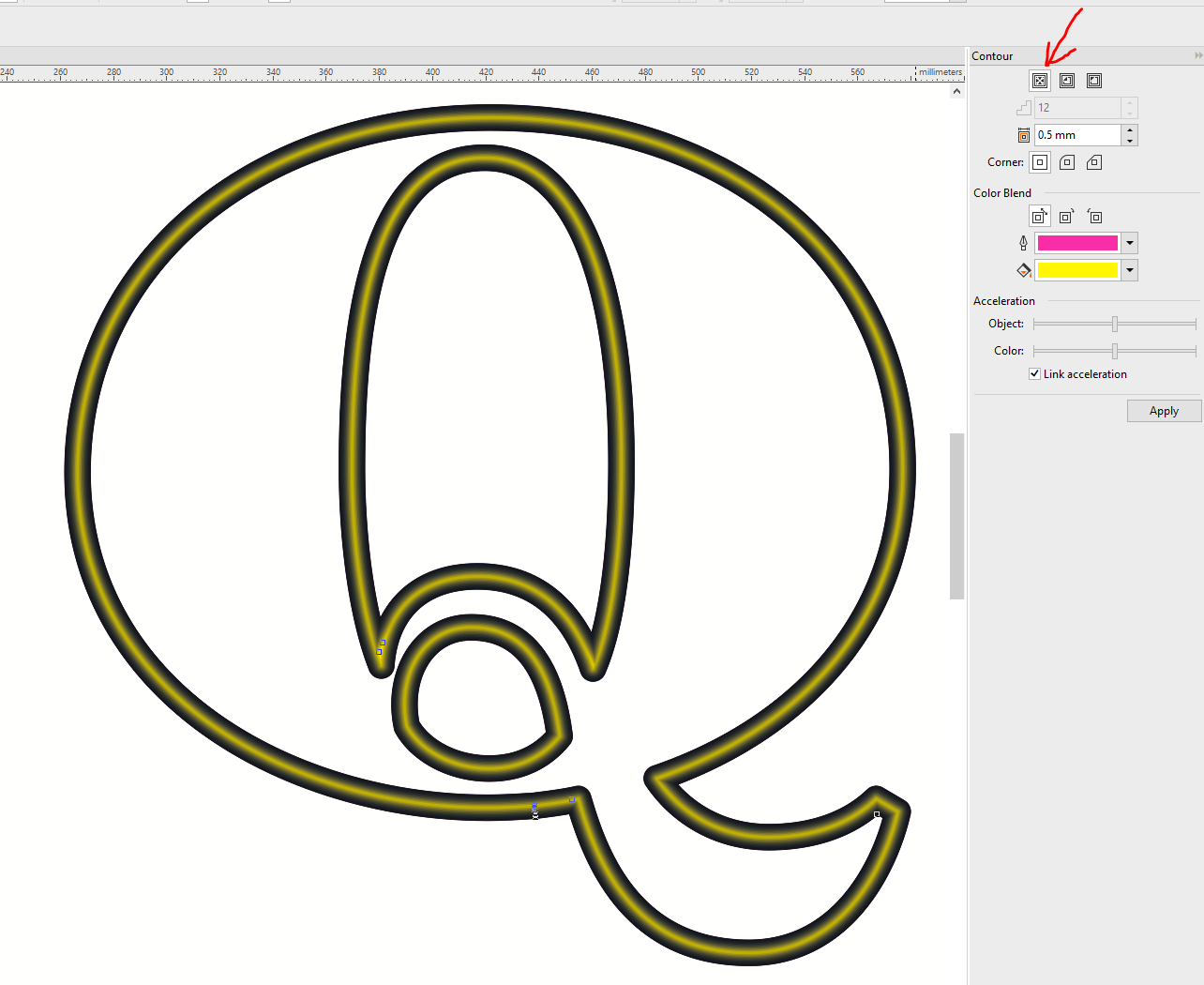
I create my actual neon tube path designs for things like open face channel letters and other stuff within CorelDRAW. Creating a good single-stroke center line is critical. I typically work in full size, so I'll assign a pen stroke to the center line the same width as my desired neon tube width, usually 12mm but sometimes 10mm for tight stuff or 15mm for really big things. The pen stroke can be converted to an object once the design is finalized, but I'm always careful to not let CorelDRAW delete the original centerline when converting the stroke. From there it's easy to apply contour effects for glow within CorelDRAW or port the artwork into Photoshop for more convincing glow effects on photo-like renderings.
Big Rice Field
Electrical/Architectural Sign Designer
Just put a glow on the object. About 5 feather and 75 opacity.
Big Rice Field
Electrical/Architectural Sign Designer
Where is the Corel "glow" command?
Just put a glow on the object. About 5 feather and 75 opacity.
Big Rice Field
Electrical/Architectural Sign Designer
Thank You. I am Running Corel X8 and will give it a try.
Big Rice Field
Electrical/Architectural Sign Designer
I do it all with vectors. I do not like bitmaps. I just make a vector, make it 15mm to scale, convert it to an object. Then I paste the vector over and over again at different pen strike witdhts and different colors. I use the neon object as a pattern by scaling it and then the production artist plots out the vector for the neon shop.
Big Rice Field
Electrical/Architectural Sign Designer
Use the drop shadow, then make it an outside shadow. Dim the feathering to about 5 and darken the shadow to around 75 opaque. If you change colors, be sure to alter the blend type.
Attached is a PDF lesson I made that shows how to make glowing neon in Corel Draw without using drop shadow bitmaps. My method even allows part of the drawing to be used as a full scale neon pen pattern. It is scaleable to any size to fit any drawing scale, or even full size
Attachments
oldgoatroper
Roper of Goats. Old ones.
...paste the vector over and over again at different pen strike witdhts and different colors.
No need to do this manually. That's what the Blend tool is for...
Roto
New Member
No need to do this manually. That's what the Blend tool is for...
Or a To Centre Contour
Last edited:
hrisantonis
New Member
Neon letters, using Corel Photopaint>>
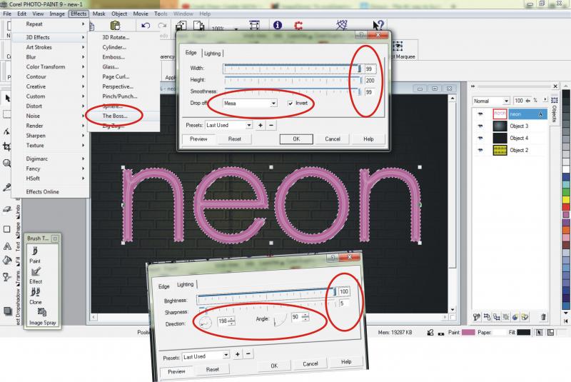
>>>>>>>>>>>
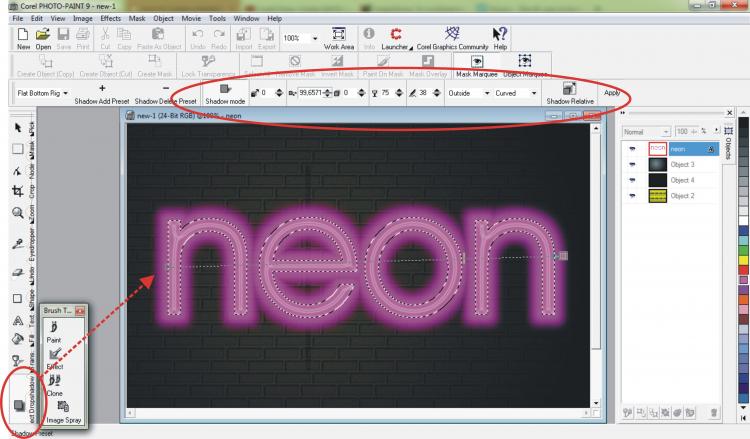 >>>>>>>>>>>>>>
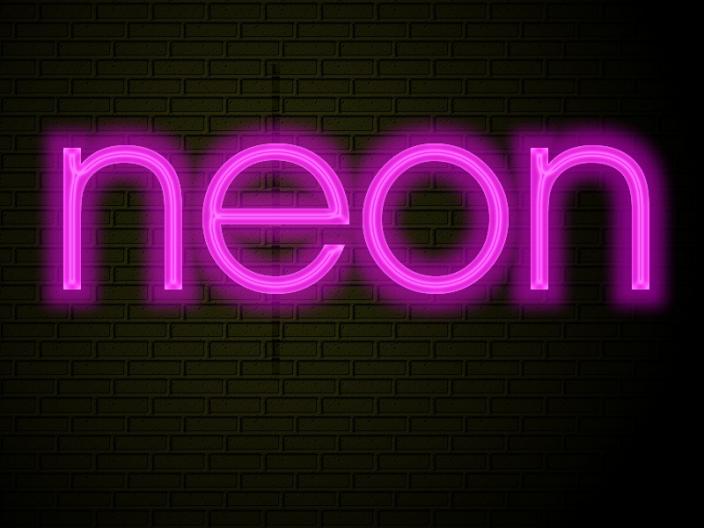

>>>>>>>>>>>


There's all sorts of ways to visually simulate the look of open faced neon channel letters in CorelDRAW.
I design the ones we build to exact specification so the letter backs & faces can be routed and the tube paths can be used for neon tube patterns. Then I concern myself later about how to make the artwork look for client sketches. I start with a full size layout. Depending on the size of the letters and the lengths of the tube paths I'll make the thickness of the tubes 10mm, 12mm, 15mm, etc. The edges of the tubes have to be a certain minimum distance from the edge of the returns. I'll create a center-line path for the tubes and use the pen tool settings to determine tube thickness. I'll keep the center-line path and make copies to convert the object to outline. For client sketches you only have to do this a couple or so different times to create a decent looking glow effect on a scale drawing. Using tons of outline or contour steps is overkill for a scale drawing. If I want to be really picky about the look of it I'll take the paths over into Photoshop and dress up a better looking rendering there. Some of this just really depends on the specific project.
Single stroke neon in channel letters can be a pain to produce. This is where the blend tool in CorelDRAW can be handy. You can break apart parts of a letter and then blend between the parallel lines to create a single stroke line in the center of the letter. You'll have to reverse path direction on one of the outer parallel lines of the letter shape. This method works best/easiest on clean, sans serif letter styles. With some of the more irregular typefaces out there you'll be stuck having to hand draw the single stroke, center path. The blend tool can also work for creating exposed neon for really large letters where multiple tubes are filling the open space.
Currently CorelDRAW does not support gradients on path strokes. Adobe Illustrator added this feature a couple versions ago. This feature can create a convincing looking neon tube effect just with one open path. Maybe some day Corel will offer the same feature in DRAW.


