• I want to thank all the members that have upgraded your accounts. I truly appreciate your support of the site monetarily. Supporting the site keeps this site up and running as a lot of work daily goes on behind the scenes. Click to Support Signs101 ...

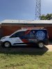
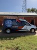
In need of help! Wanting opinions from experienced wrap installers on this Transit

Customer supplied the design. Before installation we discussed whether to follow body lines or install level to the ground, and agreed on ground level.

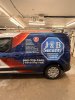
Customer is ok with the driver’s side but says the passenger side looks like it runs uphill. I’ve measured both sides from the ground and with a laser and it’s very close to exact level.
He wants the passenger side reprinted and reinstalled because it looks funny to his eyes.
My concern is that reinstalling the same artwork is going to give us the same visual result, and tilting one side to compensate doesn’t seem like the right answer either.

What would you recommend to the customer?
I’ve shown him the measurements.
I’ve done another install on a larger model with essentially the same design he was happy with it. His artist revised the design to fit this smaller model and he has another one of the same he wants done.
What is the best way to handle this and keep my customer happy?
IMG_2768.jpeg
 

Attachments

  • IMG_2767.jpeg
    IMG_2767.jpeg
    396.5 KB · Views: 141
  • IMG_2766.jpeg
    IMG_2766.jpeg
    309.6 KB · Views: 129
  • IMG_2764.jpeg
    IMG_2764.jpeg
    282.5 KB · Views: 111
  • IMG_2765.jpeg
    IMG_2765.jpeg
    227.1 KB · Views: 135

jfiscus

Rap Master
Redo both sides to follow body lines.
The customer is always right, until they aren't.
ALWAYS with body lines.
 
  • Agree
Reactions: 7 users

White Haus

Not a Newbie
Redo both sides to follow body lines.
The customer is always right, until they aren't.
ALWAYS with body lines.
Agreed. Never ask the customer which lines to follow, which materials to use etc etc.

You're the "professional", you make those calls based on your experience and your customer pays you for that.

I know some body lines are challenging (as in which one should you choose to follow) but leveling to the ground is generally not an option.

I'd strip, replace (both sides), learn from the lesson and move on.
 
  • Agree
Reactions: 3 users

DL Signs

Never go against the family
The lines that are the most prevalent and uniform is normally the best to follow, but not always. The body line above the hexagon is at the same angle as the door slide, and the same as the top of that big black molding on the side, and the door top, those are where I probably would have thought about aligning to.

It's not always that straightforward though, one thing I always do on something new is take good straight on pics of each side and do mockups with the artwork to see what will look best on each job. That little extra effort can save you.
 
  • Agree
Reactions: 4 users

Boudica

I'm here for Educational Purposes
We use artstation templates (even with customer provided artwork) and I Always follow the body line. When I do the layout in Illustrator, I create two layers of the template, one below, and a top one where I remove the fill on all the white parts so you can easily see the lines. The artwork is between the two template layers.
This ensures the artwork will flow with the vehicle and not look crooked once installed. I should add the installer uses a printer layout so they can see how it's supposed to look/land etc.
 
Redo both sides to follow body lines.
The customer is always right, until they aren't.
ALWAYS with body lines.
Agreed, all my in house designs are on templates or at minimum scaled images and I try to work the lines and obstacles of every job… This design was provided and proofed by my client and was built on a badwrap template. I will say that the original design was made for the much larger boxier t-350 … it worked on it. Client wanted to be consistent with his fleet, but yes it’s obvious the design should have been modified not only for size but also the multiple angle lines for this application.
 
  • Agree
Reactions: 1 user
Agreed . This was the design proof I received other than a couple tweaks with spacing and red swoops at the front door.
 

Attachments

  • IMG_2772.jpeg
    IMG_2772.jpeg
    91.7 KB · Views: 114
  • IMG_2772.jpeg
    IMG_2772.jpeg
    91.7 KB · Views: 119
What does the production art work look like?
This is the only image of the received artwork I have access to on my phone. It was approved by client and designer but slightly modified in the front before production and installation .
 

Attachments

  • IMG_2772.jpeg
    IMG_2772.jpeg
    91.7 KB · Views: 140

Grizzly

It’s all about your print!
Agreed . This was the design proof I received other than a couple tweaks with spacing and red swoops at the front door.
Looks really similar to the Approved mockup. Not sure why you should have to redo it at your cost. Those little vans are tough though. Like others said, either way it can look off.
 
  • Agree
Reactions: 1 user

FCD

Premium Subscriber
The main logo should have been tilted to follow the slope of the door channel. I think if you had tilted the logo, it wouldn’t have stood out as much or at all. However, very poor choice on the layout of the design. Text elements should have been sloped to match the van body lines better by the designer.
 
Ha! Ours from 2020. Their choice not ours.

View attachment 182999

The main logo should have been tilted to follow the slope of the door channel. I think if you had tilted the logo, it wouldn’t have stood out as much or at all. However, very poor choice on the layout of the design. Text elements should have been sloped to match the van body lines better by the designer.
I did try aligning it a bit angled, ran into problems with logo text still falling into the door channel on driver vs passenger as well as not enough bleed to cover the roofline.
Any suggestions as to what to offer client? He requested reinstall of same art slightly tilted down only on the passenger side to resolve the issue. Personally I would scrap and redesign the whole layout. I don’t really want to do that at my expense and the budget is already blown due to me subcontracting a previous partial wrap removal…Given it was pretty cooked on top edges but I was expecting to pay a few hours at his regular $60 hour and he charged me 9 hours at $110 for “advanced removal”
Even used my bay, pneumatic erasure wheels , chemicals, pressure washer and I still had to do touch ups
 

Jean Shimp

New Member
This is a hard call. Before redoing the passenger side, I would do a mock-up showing the difference between what you have now and changing it to follow the body lines. I don't think changing it will look good either. With this layout, I think the answer lies somewhere in between the two options, level or body lines. Just have to "fudge" it by eyeballing it until it looks somewhat correct.
 
  • Agree
Reactions: 3 users

Foremander

New Member
I still use a level on smaller stuff, door logos, a phone number, anything short like that is fine. It's long decals and full wraps where a level starts working against you, because over a short run nobody notices the difference but over a long one the gap between your level line and the body line opens up toward one end and that's what the eye picks up. On anything long I'll pick a door line, or whatever line on that particular vehicle follows its tilt, and run parallel to that instead.

Which is what you're looking at here. Your measurements are right and it still looks uphill because nobody looks at a van against the ground, they look at it against the body, and most vans sit nose down a bit with the lower body line kicking up toward the back, so dead level fights both of those and reads like it's climbing. If one is sitting really nose down I'll split the difference, but most of the time this is a design decision more than an install one.

On your customer, I wouldn't reprint the same file, you'll hang it again and he'll see exactly the same thing and now you've paid for it twice. If it has to change then it's a design change, angle it to the body line, don't reinstall the same panels.

Before you go down that road though, get a straight on photo from the middle of the van with your phone at about door handle height, because most of these arguments start with a picture taken from the front corner which exaggerates the rise, and that might be all it takes to settle it. He was happy with the larger model with the same design too, so put that photo next to this one, same artwork, same read, and he signed off on it.

Going forward I'd mock the artwork up on a photo of the actual vehicle and get a yes before anything prints, takes ten minutes and it kills this whole conversation. And since he supplied the design and you both agreed on ground level before the install, a reprint is a revision and not a warranty job, worth being clear on that now, politely, before it turns into a conversation about who pays.

Been wrapping 15 years and I still run into this one.
 
  • Agree
Reactions: 1 user
Top