• I want to thank all the members that have upgraded your accounts. I truly appreciate your support of the site monetarily. Supporting the site keeps this site up and running as a lot of work daily goes on behind the scenes. Click to Support Signs101 ...

Lettering Shadows

From time to time I used to consider shadowing one truck door to the left and the other to the right, so that both shadows would be facing the rear of the truck. I was always too lazy to put it into practice, though. Has anyone done that?
 

Mosh

New Member
Down and right. In the last year or two I have been mixing it up and going other ways, but 90% down and right.
 

JR's

New Member
round man had some good info on this.

JR
 

Attachments

  • 1 shades.jpg
    1 shades.jpg
    70 KB · Views: 90
  • art2.jpg
    art2.jpg
    43.1 KB · Views: 74

AUTO-FX

New Member
If I'm cutting vinyl or printing, always down and right. If I'm monogramming, down and left. I guess because I'm left handed. funny, I just realized this.
 

Attachments

  • tijuanataxi2.jpg
    tijuanataxi2.jpg
    26.9 KB · Views: 81

Craig Sjoquist

New Member
I use shadows to ..push words, graphics, letters, what ever ..toward main traffic and add dimension to a graphic.
When adding shadows I consider main traffic and viewing from.

I use light source for shadows for art like doing a painting when I can choose my light source.

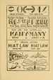
Shadows are meant to push the graphic closer to viewer and give dimension in advertising, also careful in use of the shadows
... example red letters on white background a light gray shadow is best or it is decorative using a lighter color value then red like yellow and many times can crowd the copy making it hard to read, this is why care in adding a shadow is needed.

Many times you will see red letters on white back with dark shadows like black or dark blues or orange or other colors of likeness and just destroy the copy and effect.
 

Steve C.

New Member
Just did this one yesterday. I have take to doing very subtle shading lately.
This is not a good photo, taken a dusk.
 

Attachments

  • fwme van 2.jpg
    fwme van 2.jpg
    412 KB · Views: 77

Signguyno1

New Member
Down and to the right, was taught that way in the mid fifties. Blended shades always looked better that way as well.
 

p3

New Member
It doesnt depend on the application? If I do something for a car, I usually have the shadow facing the back, so on one side it will be down to the right, and the other down to the left. Also depending on how its supposed to be viewed, if i want it to look like its going up or down. I don't know, for me it depends on what its going on to make the shadow look "right."
 

Si Allen

New Member
Waaaaay ... back BC (before computers) I was taught down and left!
2 reasons :

1. Down and left is easier and quicker to letter.

2. Makes it appear that the words are moving ahead of the shadows.


Also .... shadows are more natural looking if you use a darker shade of the background color.
 

NAC

New Member
Depends on the perceived angle you want the viewer to be looking at it. It's all about the lighting for me.

Having said that I love top shadows, possibly because I'm on the ground so much when taking photos. Just love that angle
 
Top