• I want to thank all the members that have upgraded your accounts. I truly appreciate your support of the site monetarily. Supporting the site keeps this site up and running as a lot of work daily goes on behind the scenes. Click to Support Signs101 ...

Radio Station Design

High Octane

New Member
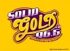
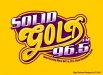
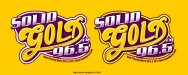
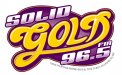
Alright guys beat me up....customer provided first logo and asked if I could dress it up a bit....the second is the one I tried to jazz up a bit...these are the colors I had to work with....trying to keep it kinda 70's looking....having a hard time with this one....any thoughts are much appreciated
 

Attachments

  • solid gold original.jpg
    solid gold original.jpg
    31.3 KB · Views: 99
  • solid gold purp and yell.jpg
    solid gold purp and yell.jpg
    63.9 KB · Views: 76

jiarby

New Member
i think it looks great... a nice improvement. The "o" in GOLD looks a little weird, like it is too small. Maybe a gradient/glow in the purple? dark to lighter... very subtle

Even so, it is a sell just like it is! Good job!
 

JR's

New Member
It looks good.
fix the O.
Is solid, gold, and 96.5 on the same angle? They all look a little different.
And maybe you could make solid a tad smaller.

JR
 

Arlo Kalon 2.0

New Member
Bumped the O up a bit

Actually, I thought the "O" in the original created a more perceptible visual dynamic to the overall design. It almost looked as if it shared the top line of the "D" - which would appear natural. If I was the one paying for it, I would select that over the revision. One thing for sure, submit a winning design in here and you'll get people compelled to find anything they can to have you change. Stick with the original - it's a masterstroke.
 

Arlo Kalon 2.0

New Member
Angles might be off a touch...still a rough

As an old signpainter, I subscribe to the theory that a good layout carries off a less than perfect execution of the lettering. The word "GOLD" looks like what a signpainter might have drawn with a charcoal stick on a board. The human eyeball will arrange it into a pleasing visual. I get into little nuances of imperfection.
 

TheSellOut

New Member
I love it!! Nice job on making it look modern-retro!

I will say this...if the station name is actually "Solid Gold FM", then I would try to bump up the size of your FM. I see that you are tring to make the 96.5 stand out, I would too, but it reads "Solid Gold". The FM looks like it was just thrown in there. It would be a tough change because you have a nice balance to it now!

If it is just "Solid Gold", then forget what I just said...it's perfect!
 

rjpjr

New Member
I really like the overall feel but I am kinda with everyone else about the "O". It looks proportionately too small to the G IMHO. Maybe something like this. Not sure I am diggin my "D".
 

Attachments

  • Solid-Gold-FM.jpg
    Solid-Gold-FM.jpg
    61.7 KB · Views: 82
I like it although I think the "GOLD" needs a little refinement. Something doesn't seem quite right, although it's very close. I think the lettering is a little thick in some places and and a little thin in others. Visually there needs to be a little more consistency in the letter forms of "GOLD" even if it's a custom typeface.

I like what RJPJR did, I can't make up my mind if it's the D or the L that's the issue, but I like your direction.
 

jscarl

New Member
I think it looks great the way you have got it now. Leave it. The distractions everyone is referring to is the extra width from the tail. Your eye incorporates it into the lettering.
 
Top