• I want to thank all the members that have upgraded your accounts. I truly appreciate your support of the site monetarily. Supporting the site keeps this site up and running as a lot of work daily goes on behind the scenes. Click to Support Signs101 ...

RPM Offroad Business Card Design

HeavyHitter

New Member
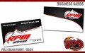
Just posted up a new design for an offroad company business card. RPM Offroad contacted me a few days ago about designing new business cards for them. The new design is simple and straight to the point. They wanted a generic card without a specific person's name on the card. It's what they wanted so there ya go....

I thought about adding something in the area between the telephone number and website. I could not decide if I liked the little RPM gauge I had dropped in the template or not. I guess I liked it better without since it is not in there. :Big Laugh

Dan
 

Attachments

  • rpm-offroad-business-cards.jpg
    rpm-offroad-business-cards.jpg
    52.9 KB · Views: 125

Marlene

New Member
I thought about adding something in the area between the telephone number and website. I could not decide if I liked the little RPM gauge I had dropped in the template or not. I guess I liked it better without since it is not in there. :Big Laugh

really good call on not adding the RPM gauge between the # and site. you knew when to stop adding "things" to a design which is a hard concept that is lost on so many designers.

the RPM gauge in the mountain with the edge of the mountain as the needle is great and a really nice design element. really good looking card!
 
Love it Dan - clean and uncluttered. I love this style of design, but at the same time glad I don't see it all the time because it makes cards like this REALLY stand out.
 

bob

It's better to have two hands than one glove.
There's nothing particularly wrong with it. Unfortunately, there's nothing particularly right with it and it's eminently forgettable. It's the kind of card that gets tossed into a bowl on someone's nightstand. When the bowl is full, it gets emptied into the trash.
 

HeavyHitter

New Member
really good call on not adding the RPM gauge between the # and site. you knew when to stop adding "things" to a design which is a hard concept that is lost on so many designers.

the RPM gauge in the mountain with the edge of the mountain as the needle is great and a really nice design element. really good looking card!

Thank you. Yeah I printed the card off a few times wondering if I should have something there. Less is more sometimes...... :thumb:
 

Flame

New Member
Dammmmm. To be honest, best work I've seen from you yet. Not always a fan of your layouts but I like this one!
 

Rodi

New Member
The graphic is the same as the place I used to work at the blue to the red, the owner he loved it. I loathed it, obviously.
 

Attachments

  • fls020609v2001001.jpg
    fls020609v2001001.jpg
    4.2 KB · Views: 92
Top