"CAS"-type
sign making applications have been able to size lettering according to cap letter height for well over 20 years. I started out in
sign making using an MS-DOS based version of CASmate and CorelDRAW 3.0 running in
Windows for Workgroups 3.11. Even way back then CASmate allowed me to select a string of lettering, enter a value such as 2" and the cap letters would indeed really be 2" tall. This was regardless if the lettering was mixed case with letters like "g" dangling parts below the base line. A cap letter "O" with parts going below the baseline and above the cap height line wouldn't throw off the measurement either (like it will in CorelDRAW).
Given the fact ancient
computer systems have been able to set letter sizes according to a font's built-in cap height value, it should not be very difficult at all for either Adobe or Corel to incorporate this feature into their applications. It should not be resource intensive at all.
The last time I made this feature request in the CorelDRAW user forums I was met with all manner of ignorant & heated sounding responses. To them type could only be set in points and picas and conform only to a baseline grid for something printed on
paper. They couldn't wrap their heads around the idea that type may have to work differently in other mediums.
If I'm putting together a door graphics design and the customer wants his store hours set in letters 1" tall, that customer will never be receptive to any print layout related excuses for why the letters are only 5/8" tall. That's basically what Adobe Illustrator will give you if you set some editable text at 1" tall. You're stuck taking extra steps, which include converting the text to outlines, in order to scale it to the correct size. If you have to change something (which is common with store hour door graphics) you'll have even more steps in the revision, rather than being able to simply select the lettering and type in a new number. Pretty stupid situation.
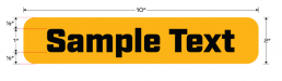
The same problem occurs in other areas. Type has to align properly in web page buttons and other user interface elements. Same goes for certain kinds of logo designs. I do a lot of work with LED-based "jumbotron" style
signs. Type looks better if you size the capitals to match the pixel grid, but none of the design applications out there (not even Photoshop) will allow you to make a 10 pixel tall capital letter truly 10 pixels tall.