• I want to thank all the members that have upgraded your accounts. I truly appreciate your support of the site monetarily. Supporting the site keeps this site up and running as a lot of work daily goes on behind the scenes. Click to Support Signs101 ...

Yay! Finally got a fun one!

TyrantDesigner

Art! Hot and fresh.
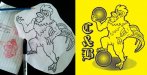
After a few long weeks of revector this, and slap some text here, and fix this 'print ready' art there ... I finally got a fun design. I convinced a group to update their 'logo' ... really it was such tiny art no matter how i re-vectored it would be different ... So I convinced them of an update. 20 glorious minutes later ... poof, custom art from a sketch and bobs your uncle a design I'm happy to see leave the computer!

Anyways, critiques welcome. What would you guys have done differently?
 

Attachments

  • Tactical-Smoke-2014-Small.jpg
    Tactical-Smoke-2014-Small.jpg
    58.1 KB · Views: 78

bob

It's better to have two hands than one glove.
What is tactical smoke, and how was this logo used?

Tactical Smoke and an image of a hog would just naturally lead one to believe that the client is producing hams for some branch of the military or another.
 

Jillbeans

New Member
I like it, but I don't like the slanted thick/thin look in that font.
Makes it look wonky...I think I'd have chosen something a little squattier and chubbier which followed the curve better.
But happy for you that you got to upsell them into something you enjoyed doing!
Love....jill
 

TyrantDesigner

Art! Hot and fresh.
Looks good. I would have left out the halftone effect though. It will restrict the types of signage they can get - i.e. nothing that requires weeding.

I already thought of that. The half tone is a 'fake' half tone (as its oversized halftone) for screen printing (the intended printing method) but It is actually not combined yet. Right now not including the text (which I agree with you guys ... but I didn't have the time to fully hunt down a nice typeface... or make one) there are 5 elements (in order of bottom to top goes half tone, white underlay of pig, black line work of pig, black underlay of crosshairs, white cross hairs.) In all I did it that way so the guys could turn it to a 2 color design with a few clicks but also if we needed to do a cut vinyl job ... 6 or 7 steps later and it's a cut-able design.

Sad part ... it's spring time ... so I'm probably going to have to draw 9 or 10 more pig designs. I have 2 more pig designs lined up ... one with a monocle and a stogie leaning out of the frame of the design (sort of like a window) ... and another of a pig screaming on fire ... it's going to be an interesting few months.
 

TyrantDesigner

Art! Hot and fresh.
I really don't ask why an IT Dept. needs a shirt like this. There is just too much to read into and I enjoy letting there be some mystery. Personally, I think they hunt wild boar ... but who knows.

It's not like jobs I finished this week that are cut and dry and pretty much stock and trade like the Attached. With stuff like that you know what you are going to expect from that sort of design.
 

Attachments

  • YUPPERS.jpg
    YUPPERS.jpg
    81.5 KB · Views: 84

TyrantDesigner

Art! Hot and fresh.
And on this weeks episode of "What the ... that isn't out there! Guess I have to draw it!"

"A rooster holding a kick ball while propping his leg up captain morgan style on another one."

I know, I know ... the feet are sort of janky.
 

Attachments

  • C&B-b.jpg
    C&B-b.jpg
    67 KB · Views: 94
Top