-
I want to thank all the members that have upgraded your accounts. I truly appreciate your support of the site monetarily. Supporting the site keeps this site up and running as a lot of work daily goes on behind the scenes. Click to Support Signs101 ...
You are using an out of date browser. It may not display this or other websites correctly.
You should upgrade or use an alternative browser.
You should upgrade or use an alternative browser.
Your Opinion of Seamless Texture Tiles
- Thread starter Fred Weiss
- Start date
Custom_Grafx
New Member
Fred, I'm looking for stubble in your books - can't seem to find. If you get one up on your site, please let me know?
Custom_Grafx
New Member
I should also respond to your original post... about opinions etc.
After getting your textures, I find regular use for them - maybe once a month or so. If it isn't for making a sign, it's for doing a mock up of what something will look like, or just for plain fun/practice.
One example is for brushed silver/gold rowmark or stainless signs - when I send my clients a proof that looks like the finished product, it makes me look all the more professional - so thanks!
I'm still not 100% used to using them all the time, but they make me think more about using them - because when they are used correctly they look really impressive.
One important thing about your tiles which people may not realise until they've tried yours VS other tiles, is that resolution is paramount in making these usable for commercial purposes - especially since most of us here use wide format - and not just printing birthday cards on a desktop inkjet.
Like most people here, I'm a vector person originally - corel and illy. I've only really played with PS in the last year or two.
Just a theory, but I find that the use of your tiles, are much better utilised in PS. I can't see much flexibility happening in Ai or corel... well maybe photopaint - but again, most people in signs are accustomed to vector programs. I can see why this could be a deterrent to the signies who aren't comfortable in PS for example.
Also, looking at your site and books that come with the discs - I think it could really inspire people more if there were a variety of samples spanning different industry sectors, making use of your textures in different situations.
I see myself using textures more in the future as I feel more comfortable using them in the right context.
10sacer
New Member
For me its around shading/shadowing. Some seamless textures just don't look real when you join them together because any shadowing is stagnant across the image - meaning - if I tile something together that is 8 feet across - the shadowing should be different from one end to the other to make it look more realistic/natural. Carbon fiber patterns have this problem.
Fred Weiss
Merchant Member
For me its around shading/shadowing. Some seamless textures just don't look real when you join them together because any shadowing is stagnant across the image - meaning - if I tile something together that is 8 feet across - the shadowing should be different from one end to the other to make it look more realistic/natural. Carbon fiber patterns have this problem.
I agree and when we used to be a dealer for a well know company in Kansas we heard this a lot. Most of the tiles we produce are free from any artificial lighting or shadowing effect. The problem, from the developer's point of view, is with buyers who tend to be most attracted to a tile if it looks good on its own rather than imagining what the tile will look like when repeated. Seamless tiles are a resource intended to be part of a solution for creating backgrounds and fills ... not as a standalone image like object oriented clipart.
The approach we recommend is to create the tiling one its own layer in an image editor such as Photoshop and then add a second layer to the overall image for such effects such as how we've done in the attached example.
Attachments
Fred Weiss
Merchant Member
Fred, I'm looking for stubble in your books - can't seem to find. If you get one up on your site, please let me know?
Hmmmmm ... never thought of that. Here's a computer generated quickie as a starting point. The best approach would be for you to send me a nice size and detailed photo of the stubble you'd like to have as a tile and I can probably come up with something much better and more realistic.
Attachments

Fred Weiss
Merchant Member
I should also respond to your original post... about opinions etc.
After getting your textures, I find regular use for them - maybe once a month or so. If it isn't for making a sign, it's for doing a mock up of what something will look like, or just for plain fun/practice.
One example is for brushed silver/gold rowmark or stainless signs - when I send my clients a proof that looks like the finished product, it makes me look all the more professional - so thanks!
I'm still not 100% used to using them all the time, but they make me think more about using them - because when they are used correctly they look really impressive.
One important thing about your tiles which people may not realise until they've tried yours VS other tiles, is that resolution is paramount in making these usable for commercial purposes - especially since most of us here use wide format - and not just printing birthday cards on a desktop inkjet.
Like most people here, I'm a vector person originally - corel and illy. I've only really played with PS in the last year or two.
Just a theory, but I find that the use of your tiles, are much better utilised in PS. I can't see much flexibility happening in Ai or corel... well maybe photopaint - but again, most people in signs are accustomed to vector programs. I can see why this could be a deterrent to the signies who aren't comfortable in PS for example.
Also, looking at your site and books that come with the discs - I think it could really inspire people more if there were a variety of samples spanning different industry sectors, making use of your textures in different situations.
I see myself using textures more in the future as I feel more comfortable using them in the right context.
I don't agree with you at all. Some of the most striking work you'll ever see is done using both vectors and images together along with the capabilities of both Photoshop and Illustrator combined.
phototec
New Member
I don't agree with you at all. Some of the most striking work you'll ever see is done using both vectors and images together along with the capabilities of both Photoshop and Illustrator combined.
Fred, you are 1000% right on, got to use both, almost every graphic project I work on is created with both Illy and PS, and I love their seamless integration.
Regarding seamless texture tiles: I don't really like to use them, many look fake to me, I prefer real background textures (see green example below), that are slightly different from edge to edge, and one corner to the other corner.
IMO

Attachments

Last edited by a moderator:
Fred Weiss
Merchant Member
Regarding seamless texture tiles: I don't really like to use them, many look fake to me, I prefer real background textures (see green example below), that are slightly different from edge to edge, and one corner to the other corner.
IMO
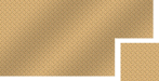
Some textures ... many textures, are generated "procedurally", which is to say from mathematical noise and then manipulated to look like something real. As with many things, there are good ones and some that not so good. Call it art imitating life. This is an example of a procedural tile:

Tiles can also be created from photographic originals as with this one:

Here's the coffee beans extended out to 2 tiles high and 4 tiles wide with some text, text effects and shadowing added.

But with either, you are able to create as large an image area as needed without sacrificing image quality by repeating the tile which isn't usually the case with other images that are often enlarged to meet the size requirements of the print. At that point, other effects can be added to suit one's taste and needs such as the glow behind the trailer in your example which gives it more of a real world feel. Such an effect would also work well with a seamlessly tiled background as well.
Here's a link to some of my images at Shutterstock, sorted by popularity. The procedurally generated blue electricity has been purchased 87 times in the last 10 months. The brown crocodile hide generated from a photographic original has been purchased 94 times in 10 months. And, of course, either image could be altered in Photoshop to change colors, add lighting effects, overlay gradients or anything else one might imagine to make it a unique part of an overall design without having to ever touch the Resize Image command.
Last edited:
sfr table hockey
New Member
I am still learning Illustrator and I don't want to ask a stupid question with clip art tiles but I will anyway.
When you talk about setting up tiles of 4 rows wide by 2 deep, I thought that was the only way to use them but....
In illustrator with a file open I place the tile I want and then size the square tile down till I get the image to be the size I want. So if you want small beans you make the square smaller till the beans look the right size.
I then just drag that square into my swatch pannel and it appears as a swatch now with the beans at that size. Then when you make a square or circle you just fill it with that swatch and it fills it with the bean at the right size. If you wanted bigger beans then make sure the tile is larger before you drag it to the swatch pannel.
I would think this is what most of you do...... is it not?
From there I would add shading by adding a shape over top with a gradient overlay.
I just found it too hard to tile a bunch of squares till I got enough.
Go one step further and you can use them for fill for fonts etc. even the stroke.
Fred Weiss
Merchant Member
I am still learning Illustrator and I don't want to ask a stupid question with clip art tiles but I will anyway.
When you talk about setting up tiles of 4 rows wide by 2 deep, I thought that was the only way to use them but....
In illustrator with a file open I place the tile I want and then size the square tile down till I get the image to be the size I want. So if you want small beans you make the square smaller till the beans look the right size.
I then just drag that square into my swatch pannel and it appears as a swatch now with the beans at that size. Then when you make a square or circle you just fill it with that swatch and it fills it with the bean at the right size. If you wanted bigger beans then make sure the tile is larger before you drag it to the swatch pannel.
I would think this is what most of you do...... is it not?
From there I would add shading by adding a shape over top with a gradient overlay.
I just found it too hard to tile a bunch of squares till I got enough.
Go one step further and you can use them for fill for fonts etc. even the stroke.
There are two aspects to setting up a tiled background or fill. The first is the creation of a fill large enough to meet the needs of the layout and the second is scaling the fill to look appropriate to the layout. There are a number of ways to accomplish this including what you described. The advantage of using a tile at a high enough resolution however, is that you will get beautiful results if you are downsizing the scale. You may not get such good results if you size it up.
My preference is to use tiles by defining them as patterns.
sfr table hockey
New Member
Sorry but I an not quite getting that part about not getting good results when sizing up.
If we use the bean size as a sample do you mean if you create a swatch with a bean at the size you want in proportion to your layout (lets say 1 inch long) it will look different, at 100% viewing, by doing it the two ways?
Just trying to wrap my head around this one.
If we use the bean size as a sample do you mean if you create a swatch with a bean at the size you want in proportion to your layout (lets say 1 inch long) it will look different, at 100% viewing, by doing it the two ways?
Just trying to wrap my head around this one.
Fred Weiss
Merchant Member
I'm talking about enlarging any image. Pick a bean out of the whole image and if it's 1/4" long at the PPI you want to use and you need it to be 1" long then you have to enlarge it to 400% of its current size. You can expect some visible loss of quality with any image you do this to.
To enlarge it you either accept less pixels per inch or you resample the image using the algorithms in the software you're using. This isn't the same as decreasing the size which has little or no impact on quality. so what I'm saying is that you want to have a large enough image (in PPI) to begin with and the ability to build a large image without having to resample it. This is most easily done by tiling the image.
The typical tile you find out there on the internet might be as small as 200 x 200 pixels. So if you want to build an image that's ten feet long with a PPI of 100, then you will need an image that is 12,000 pixels wide. That will require 60 of the 200 x 200 tiles. If you use our tiles, they are created at 3,600 x 3,600 PPI so you only need 3 1/3 of them. If you have to scale the image so that the coffee bean comes out to 1" in length and you use ours, you'll likely find that ours will only require a scaling down in size and you might end up stringing 5 or 6 tiles together to achieve the combined scale and overall size. If you're using a smaller tile, let's say a 1,000 x 1,000 one, the chances are you will need to string more together and enlarge the image.
The more repeats you have, the greater the tendency to produce noticeably visible repeat patterns in the image. The more enlarging you have to do to to get the scale right, the greater the tendency to generate noticeable artifacts in the finished image. So never enlarge a tile if you can avoid it and always be aware that your software is repeating your tile that you made into a swatch and check to see whether or not the result is acceptable.
phototec
New Member
Some textures ... many textures, are generated "procedurally", which is to say from mathematical noise and then manipulated to look like something real. As with many things, there are good ones and some that not so good. Call it art imitating life. This is an example of a procedural tile:
View attachment 65674
Tiles can also be created from photographic originals as with this one:
View attachment 65675
Here's the coffee beans extended out to 2 tiles high and 4 tiles wide with some text, text effects and shadowing added.
View attachment 65676
Fred,
You asked for an opinion, and I gave it, you posted and example of a tiled background image, I have posted that example image indicating the areas which I consider, look fake (repetitive).
The highlighted green indicates the repetitive beans, and they do not look natural, if you poured a pile of beans on the floor, you would never get them to look repetitive like this.
Also, the highlighted pink area almost looks almost like a vertical seam between tiles?
Not looking for a fight, just making my point that many titled backgrounds do not look natural to ME!
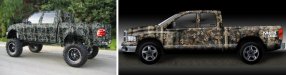
Now lets talk about another pet peeve of mine, good and bad CAMO textures, I have seen many bad camo patterns (see example below), which are again just repetitive tiles of the same pattern over and over, and in no way are representative of nature. I believe because of the repetitive images, your eye is actually drawn to the camo instead of the intent to blend into the background.
The example on the left is a typical BAD camo pattern, you can see the same repetitive image all the way down the side of the truck (FAKE). The example on the right, which is a good representation of an actual REAL wooded area, and is so much better then the tiled image, but again, I have a good eye for detail, and can see the difference, maybe others can't see the obvious repetitive images on the left example?

Attachments

HulkSmash
New Member
Fred,
You asked for an opinion, and I gave it, you posted and example of a tiled background image, I have posted that example image indicating the areas which I consider, look fake (repetitive).
The highlighted green indicates the repetitive beans, and they do not look natural, if you poured a pile of beans on the floor, you would never get them to look repetitive like this.
Also, the highlighted pink area almost looks almost like a vertical seam between tiles?
Not looking for a fight, just making my point that many titled backgrounds do not look natural to ME!
Now lets talk about another pet peeve of mine, good and bad CAMO textures, I have seen many bad camo patterns (see example below), which are again just repetitive tiles of the same pattern over and over, and in no way are representative of nature. I believe because of the repetitive images, your eye is actually drawn to the camo instead of the intent to blend into the background.
The example on the left is a typical BAD camo pattern, you can see the same repetitive image all the way down the side of the truck (FAKE). The example on the right, which is a good representation of an actual REAL wooded area, and is so much better then the tiled image, but again, I have a good eye for detail, and can see the difference, maybe others can't see the obvious repetitive images on the left example?
There's a place for everything. As a "designer" You're going to look for those small things. On a typical sign or wrap, no one is going to notice the small knit seams that create the bigger image.
Fred i have used some of your stuff in the past. Specifically engine turn patters, and diamond plate, because it's EXTREMELY hard to point our a seam. Some of the things on there, for example the old fashion clip art is not something i would use. But that doesn't mean the next person won't. Most patterns our designers use now are just straight vector. It's just much easier to work with, and looks much cleaner. Most of our clients PREFER that over straight images. It's just what's in.
Custom_Grafx
New Member
I don't agree with you at all. Some of the most striking work you'll ever see is done using both vectors and images together along with the capabilities of both Photoshop and Illustrator combined.
Sorry for the misunderstanding... I don't understand what you don't agree with.
I also believe that using the combination is what brings out the best in the tiles (and a lot of designs) - only having vector knowledge, limits its potential is all I'm saying.
Re the stubble - I will try to get a good photo. This actually started out as fun, when a friend told me it would be both disturbing/interesting to do a surface either wrapped in cast or maybe just a flat wall graphic in a room, in the texture of either skin (showing pores etc), or stubble.
I just did a quick search in google and found this picture -I guess something like this could be interesting?
http://textures.forrest.cz/index.php?spgmGal=skinandfur&spgmPic=48#?
Fred Weiss
Merchant Member
Sorry for the misunderstanding... I don't understand what you don't agree with.
I also believe that using the combination is what brings out the best in the tiles (and a lot of designs) - only having vector knowledge, limits its potential is all I'm saying.
Re the stubble - I will try to get a good photo. This actually started out as fun, when a friend told me it would be both disturbing/interesting to do a surface either wrapped in cast or maybe just a flat wall graphic in a room, in the texture of either skin (showing pores etc), or stubble.
I just did a quick search in google and found this picture -I guess something like this could be interesting?
http://textures.forrest.cz/index.php?spgmGal=skinandfur&spgmPic=48#?
Here's a tile made from the image you linked. 900 x 900 pixels is as large as I could take it but it might work out for you.
Attachments
Custom_Grafx
New Member
Thank you, that looks pretty good! I'll test it out on a couple of things and post some pics when time permits.
My use of seamless tiles is infrequent, however I am always cognizant of their value. I absolutely agree with Stacey in that knowing that the service is available would make me try to use it. It's like any other resource, tool or equipment, if you have it and are familiar with it then you will use it and/or design with it. If you don't have something available then you avoid that direction. I think that is why we don't use more seamless tiles also, because people here aren't familiar enough with the proper way or variety of ways you can use them. I am aware of great designs that you can create using tiles and/or other digital manipulations but I am not practiced enough in that area to make regular use of them.