-
I want to thank all the members that have upgraded your accounts. I truly appreciate your support of the site monetarily. Supporting the site keeps this site up and running as a lot of work daily goes on behind the scenes. Click to Support Signs101 ...
Search results
-

Advice on adhering acrylic to routed aluminum cabinet face
Ive always done VHB and siliconed only top edging to allow water to not get in from top edge BUT water can safely pass thru bottom if it gets in thru front face- visual800
- Post #5
- Forum: General Signmaking Topics
-
-
Freeway Sign Wholesaler!
ozark safety supply see if theres any safety supply near you- visual800
- Post #2
- Forum: Product and Supplier Referrals
-
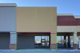
frontage calculation question...
i would say referring to pink only the green part has nothing to do with signage. As far as 15% just throw a design on it no one follows that crap anymore, everyone is just happy to have tenants. Some idiot architect made up those rules and they only applied when the first tenants moved in lol- visual800
- Post #13
- Forum: Electric Signs & Channel Letters
-
Need Help Difference ADA vs ABA Interior Sign?
and right when you thought the disability BS could not get any deeper- visual800
- Post #4
- Forum: General Signmaking Topics
-
Question ORACAL 751 070 Gloss Black Out of stock everywhere?
I am having to use sucka$$ avery black as a substitute and I hate it. It is "cruchier" than oracal and it cuts at 15 grams more weight than oracal on my plotter. you can definitely tell the difference between them- visual800
- Post #18
- Forum: Product and Supplier Referrals
-
Fired a customer
Ive gotten rid of more in this past 2 years than ever. my patience is wearing thin with age. I have no tolerance for BS or time wasters. Good for you for kicking them to curb- visual800
- Post #10
- Forum: Sales, Marketing, Pricing Etc.
-
Fonts - Why is it so Easy to Find Free Fonts?
Ive noticed that also. You can find just about any font if you look hard enough. As far as using them for my purposes or copyright issues. I dont worry about the font police getting on my back- visual800
- Post #3
- Forum: General Chit-Chat
-
-
-
Rush Fees
I love this topic. My old saying is "if you wanted it tomorrow you should have ordered it two weeks ago." People dont NEED things now they WANT it now. I dont do rush things UNLESS its an old customer and I have supplies on hand. Rush jobs in general can be a PITA, once you commit to doing...- visual800
- Post #11
- Forum: General Signmaking Topics
-
Need help finding storage container
what about taping them to a 4x8 material and storing them upright- visual800
- Post #2
- Forum: Product and Supplier Referrals
-
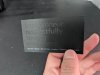
What is this business card texture called?
there are sooo many textures available these days. I could not locate the one you are holding- visual800
- Post #3
- Forum: Promotional Products
-
Paint acrylic and aluminum letters: where to start?
I spray latex, last long and is flexible. Always spray wiyj 2 part epoxy primers. I do NOT rattle can anything just my personal preference. I have used matthews and its good stuff....automotive bc/cc are too damn expensive now to even consider- visual800
- Post #12
- Forum: Dimensional Signs
-
Mounting Acrylic Letters - change of plans
paint the backs of the acrylic letters with 2 part epoxy primer and you can silicone them to new substrate and not have to drill anything I would use a latex painted aluminum backing with a color that complemented the brick and silicone the acrylic to it- visual800
- Post #6
- Forum: General Signmaking Topics
-
Look What I found!
never seen it, didnt care, still dont. Covert it to dvd and see if they buy it- visual800
- Post #24
- Forum: General Chit-Chat
-
Best outdoor materials for dimension & durability
EXACTLY! thats the crap we get more in this town than anything -
Best outdoor materials for dimension & durability
you cant go wrong with aluminum and dimesional pvc letters. adding a 1" frame behind it adds more ooomph -
Dimensional letters thickness vs height vs distance
acrylic over time will lose its gloss, 1/4" thick and up will hold its own as far as longevity vs 1/8" thick which you have no business using anyway. if you could paint the letter with latex I think it would hold out better than the factory finish. some are painted with mathews and after a...- visual800
- Post #16
- Forum: General Signmaking Topics
-
Dimensional letters thickness vs height vs distance
lol sweet mother of God how I love anything from the govt trying to explain something. IMO there is no set way to absolutely nail a proper distance vs height vs thickness vs color. These days the best thing we have is digital. We can take a pic and super impose the lettering height and color on...- visual800
- Post #15
- Forum: General Signmaking Topics
-
Dimensional letters thickness vs height vs distance
I would quote them on 3/16" thick and then 1/2" thick, a 10" tall letter can be made out of foam, pvc or acrylic. There is nothing wrong with using any of these products. 12ft to 15ft up in the air needs at LEAST 1/2" thick material to even look decent. 3/16 would look cheap and cheesy- visual800
- Post #10
- Forum: General Signmaking Topics