-
I want to thank all the members that have upgraded your accounts. I truly appreciate your support of the site monetarily. Supporting the site keeps this site up and running as a lot of work daily goes on behind the scenes. Click to Support Signs101 ...
Search results
-
New Zealand
First, Trump is throwing out plenty of stupid insults towards the Kiwis at the "terrible surge" of new cases in New Zealand. The criticism going on is not happening in a one way matter. I don't think anyone in the US has any place whatsoever to spout criticism at the Kiwis over their response to...- Bobby H
- Post #10
- Forum: General Chit-Chat
-
-
Type to curve around circle
I'm not a big fan of the Text on Path effect in CorelDRAW. The effect often yields wacky looking character placement. The spacing is almost always off kilter and the same goes for rotation. Whenever I have to make one of those seal style logos with lettering wrapping around a circle I always...- Bobby H
- Post #7
- Forum: Designs & Layouts
-

Font ID Help - Close to Helvetica Ultra Compressed, but not quite.
Like I said in the original post, Helvetica Ultra Compressed is close, but not quite it. If you line up that typeface over the sample lettering you'll see various features in the lettering not lining up. I've looked at a bunch of other typefaces, including all through Adobe Fonts' collection...- Bobby H
- Post #9
- Forum: Fonts and Typography
-
I am hating CorelDraw 2020!
I have CorelDRAW 2020 installed, but rarely use it. I kept CorelDRAW 2018 on my work desktop and X8 on my notebook at home. Versions CDR X8 and CDR 2018 are pretty stable. CorelDRAW 2020 is a slight improvement over the bug-ridden disaster that was version 2019. Some of the bugs are gone, but... -
Font ID Help - Close to Helvetica Ultra Compressed, but not quite.
Swiss 911 is almost a carbon copy of Helvetica Ultra Compressed (very slight differences). The capital "B" doesn't line up with features of the "B' in the sample lettering, even when distorted to the proportions of the letter. Not even close.- Bobby H
- Post #5
- Forum: Fonts and Typography
-
Font ID Help - Close to Helvetica Ultra Compressed, but not quite.
I'm trying to figure out what typeface was used in the attached sample. At first glance it looks like Helvetica Ultra Compressed, but artificially squeezed a little more. But the "B" is different in the upper area and there's all sorts of other differences. Compacta looked slightly similar...- Bobby H
- Thread
- Replies: 8
- Forum: Fonts and Typography
-

He called me for help with his sign
When someone chooses the default Arial sign design look there's nothing like taking the theme all the way by squeezing and stretching the ugly default type. Extra points for doing additional squeezing and stretching after the multiple outline effects are added. That way nothing is uniform in...- Bobby H
- Post #3
- Forum: General Chit-Chat
-

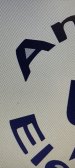
Font ID Request
I can't seem to locate a match for the typeface used in the attached sample image. The "C" is really odd looking. Figured it must be a freebie type of font. Couldn't find anything like it at DaFont.- Bobby H
- Thread
- Replies: 1
- Forum: Fonts and Typography
-
Freaking Stupid Dell botches the new XPS 17
Still undecided. I'm weighing the pros and cons of the XPS 17 9700 against a couple other systems, such as the Razer Blade Pro 17. The Razer unit costs a lot more, is physically bigger and gets significantly less battery life (but not nearly as horrible bad as the Alienware M17 R3). But the 17"...- Bobby H
- Post #59
- Forum: Computer Hardware
-

We could all use a little John Candy about now...
IIRC that's the font used on Samuel Jackson's wallet in Pulp Fiction.- Bobby H
- Post #4
- Forum: Fonts and Typography
-
Freaking Stupid Dell botches the new XPS 17
Thread Bump for some updated news: https://www.pcworld.com/article/3569131/dell-fixes-charging-issues-with-some-xps-17-9700-laptops.html...- Bobby H
- Post #57
- Forum: Computer Hardware
-

Font ID Needed - Similar to Avant Garde
Just like the subject line says, I'm trying to match the typeface in the attached sample image. At first glance it looks very much like Avant Garde. But the terminals on some of the letters (like "S" and "C") are slanted, not horizontal. There's a number of other subtle differences. Other...- Bobby H
- Thread
- Replies: 1
- Forum: Fonts and Typography
-
Choosing colors that look good together
I kind of like using Adobe's "color" web site. IIRC it used to be called "kuler." The web site is: https://color.adobe.com Users of Creative Cloud can save the color palettes generated there for use in Adobe's applications. They just added some new accessibility tools to make color choices more...- Bobby H
- Post #6
- Forum: General Signmaking Topics
-
Design Ownership **Rant**
We don't have a flat policy on design charges or releasing vector-based art files to clients. If it's a simple project, such as text only and maybe a production ready logo they supplied we won't hesitate to give them art files. Design charges do come into play for lots of other things. We do...- Bobby H
- Post #17
- Forum: General Chit-Chat
-
Polycarbonite shortage...
We're seeing shortages in acrylic and polycarbonate. Back orders are going out 6 weeks or more.- Bobby H
- Post #12
- Forum: General Chit-Chat
-
Freaking Stupid Dell botches the new XPS 17
That could be the case.- Bobby H
- Post #49
- Forum: Computer Hardware
-
Discussion What's the most common design mistake you see made in sign design?
While the "little guys" have a tendency to clutter up their signs with phone numbers the bigger companies are striving to simplify their signs, stripping away as much extraneous stuff as possible to arrive at something far more legible and far more powerful at reinforcing the brand.- Bobby H
- Post #71
- Forum: New Member Introductions
-
Freaking Stupid Dell botches the new XPS 17
I was responding to Pauly's comment.- Bobby H
- Post #47
- Forum: Computer Hardware
-
Freaking Stupid Dell botches the new XPS 17
I never said I wanted to buy a gaming laptop. I wanted something just powerful enough but not so top of the line powerful that it sacrifices any portability. Apple clearly understands that concept with their notebooks. It's just too bad that OSX is the wrong OS for my needs, too bad that Apple...- Bobby H
- Post #45
- Forum: Computer Hardware
-
Freaking Stupid Dell botches the new XPS 17
"M51"? Alienware has the M15 and M17 notebooks (3rd generation now available) and the Area 51 notebook featuring up to a 10-core i9 desktop CPU. Those all can be ordered in brutally powerful configurations (for lots of $$$). But they have to stay tethered to a wall outlet nearly all the time...- Bobby H
- Post #42
- Forum: Computer Hardware