-
I want to thank all the members that have upgraded your accounts. I truly appreciate your support of the site monetarily. Supporting the site keeps this site up and running as a lot of work daily goes on behind the scenes. Click to Support Signs101 ...
Search results
-

Yesterdays Sprinter
Looks good. Phone number just looks a bit crammed - and surprised they don't have a web site listed.- Dan Antonelli
- Post #3
- Forum: Portfolio Board
-
-

H2 we just did.......
Nice job - mission accomplished. Legible, impactful, and branded. Thumbs up.- Dan Antonelli
- Post #10
- Forum: Vehicle Wraps
-

My wrap design.. I'm looking for help from the best
Lets not forget the two most important words in vehicle wraps; forgotten by most, and beloved by so few: Distance Legibility- Dan Antonelli
- Post #30
- Forum: Vehicle Wraps
-

I don't TWEET, therefor I have a life.
Yes Twitter and FB are real bad for your business. You shouldn't do it. The more people off of it, the better... (well, for the rest of us at least!). :)- Dan Antonelli
- Post #36
- Forum: General Chit-Chat
-
-
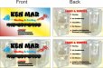
business card layout
It's a little awkward the presentation, and the typesetting on the rear is also a bit odd. Here's a link to our stationery gallery on our site which may spark some ideas: http://graphicd-signs.com/stationery/gallery/index.htm- Dan Antonelli
- Post #15
- Forum: Designs & Layouts
-

-

Contracting Logo
Its funny - had a client request same thing - a builder. This was after round 1 of comps. To show him how ridiculous the idea was, I had to mock up his 'idea' which was same as what you're showing now. Afterwards, I got the 'yeh, you're right - that looks bad' and then they picked one of the...- Dan Antonelli
- Post #7
- Forum: Logo Design
-
I don't TWEET, therefor I have a life.
Don't underestimate the value of the marketing aspect of it. In my view, there's no harm with 300 people out there, whether I went to high school or college or whatever, knowing what I do for a living. It's already resulted in a decent amount of business. Im not as big a fan of Twitter as I am...- Dan Antonelli
- Post #15
- Forum: General Chit-Chat
-
Did anyone else notice....
....that in the movie The Perfect Storm - the boat lettering for sailing vessel Mistral is lettered with the font Mistral also? I'm way too much into typography.:cool1:- Dan Antonelli
- Thread
- Replies: 8
- Forum: General Chit-Chat
-
Website ???
I'm surprised yellow pages are still in business. Their online ads also are relatively worthless. A web site is infinitely more valuable - just make sure you get a properly designed AND optimized web site - otherwise - it's almost just as worthless. Most sign sites I've seen are not optimized...- Dan Antonelli
- Post #7
- Forum: General Signmaking Topics
-

Another crappy design....
Any of you guys remember the Ugly Sign Contest that Signs of the Times magazine used to run? Those were always good for a few laughs. I think here, we're all just sharing a lighter moment. Life's too serious some days. I think if someone had posted this as a layout, looking for honest feedback...- Dan Antonelli
- Post #28
- Forum: General Chit-Chat
-
Another crappy design....
Yeh, 2nd surgery planned on it in a few weeks. Woulda been easier to use the chop saw in the garage.- Dan Antonelli
- Post #26
- Forum: General Chit-Chat
-

something quick
Please, oh please, refrain from using black drop shadows on white backgrounds. Jill, ya nailed it with the last one. I'm buying that script too - thats hot.- Dan Antonelli
- Post #30
- Forum: Logo Design
-
Another crappy design....
Looks good to me. I especially like the use of the large phone number. And are those legs or forearms holding onto something? That elements works well because the viewer is really stumped as to what it actually is, therefore they spend extra time trying to discern the art. Plus the 5 typefaces...- Dan Antonelli
- Post #4
- Forum: General Chit-Chat
-
Graphic design classes
Although I don't run a sign shop, our entry level jobs require 4 year degrees - and all my designers have them (all have BAs or BFAs) except one, with an associates. Sure there's some pie-in-sky stuff taught in art schools - but when assessing candidates, I'm not only interested in how well...- Dan Antonelli
- Post #29
- Forum: General Chit-Chat
-

Opinions and critiques of design invited
Phil and Rick - really nice suggestions...- Dan Antonelli
- Post #44
- Forum: Logo Design
-
Opinions and critiques of design invited
The layout is good! That counts! This new typeface looks like a really bad auto-traced-scan-gone-awry. You have to have something better! I guess not knowing what a black trumpet mushroom is, or what that has to do with a cafe/coffee shop is perhaps throwing me a bit. Like, would you go to...- Dan Antonelli
- Post #19
- Forum: Logo Design
-
Opinions and critiques of design invited
Really don't like the typography. The layout is OK, but I think the icon would work better in print rather than an outdoor realm, as I think the viewer needs to work to hard to discern it at a distance. Wish the icon was bolder and more obvious to the reader, and the typography had more...- Dan Antonelli
- Post #16
- Forum: Logo Design
-

ProWraps Shop Truck Finally Done
I like it much better now that it's done than I did when it was a sketch. Wonder why? Given your audience, I bet it's a homerun out there.- Dan Antonelli
- Post #19
- Forum: Vehicle Wraps