-
I want to thank all the members that have upgraded your accounts. I truly appreciate your support of the site monetarily. Supporting the site keeps this site up and running as a lot of work daily goes on behind the scenes. Click to Support Signs101 ...
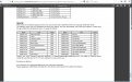
Search results
-

greys cannot solve problem
Are you loading RGB files and letting your rip software convert them to CMYK?- DesireeM
- Post #9
- Forum: Sublimation Printing
-
-
SG-300 double cutting everything.
Did you click on the link he has in his reply? There's a step-by step explanation on where to find that option. The link seems to apply to files loaded in VW Dual and that have transparencies. -

Neo Chrome vinyl
Not sure about a supplier but I think the common term is "Holographic" so maybe if you Google Holographic vinyl you might find something. -
Buyer Beware! Avery Supreme Wrap Material.
Hello, Just hoping to save some people headaches like mine in the future... I had a city bus to wrap in Orange vinyl and ordered Avery's Supreme wrapping film in that colour. I assumed (why do I do that?) the vinyl was Opaque considering what it's sold for, but I found out that it was not. It...- DesireeM
- Thread
- Replies: 5
- Forum: Vehicle Wraps
-

Help Plz!
Wondering if anyone can identify the script font and/or the sans serif at the bottom. Thanks!- DesireeM
- Thread
- Replies: 4
- Forum: Fonts and Typography
-

Renegade font. Help plz!
- DesireeM
- Thread
- Replies: 0
- Forum: Fonts and Typography
-
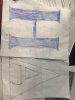
Font help - Traced from routed acrylic letters
Thanks for all the suggestions guys! So far the closest I've gotten is Beaufort or Toledo but not the exact match.... I think I'll have to try a different approach.- DesireeM
- Post #13
- Forum: Fonts and Typography
-
Font help - Traced from routed acrylic letters
Yes, I believe I said above that Optima is a sans-serif and so it wasn't in the ballpark. I realize the tracings aren't great. They are from the customer who did the best they could. It's all I have to go off of plus a blurry photo so that's why I'm here asking all you expert font finders :)- DesireeM
- Post #12
- Forum: Fonts and Typography
-
Font help - Traced from routed acrylic letters
Not Optima Bold. It's a sans-serif font. Thanks though.- DesireeM
- Post #3
- Forum: Fonts and Typography
-
Font help - Traced from routed acrylic letters
Anyone know?- DesireeM
- Thread
- Replies: 14
- Forum: Fonts and Typography
-
Caught ya.........................
Googled "why Q looks like 2" and got this as the first result http://blurtblog.net/2013/06/07/why-does-upper-case-cursive-q-look-like-a-2/ The wording in this article is eerily similar to your original post Gino. The two paragraphs after "Drawing Out Their Points"... The article even...- DesireeM
- Post #6
- Forum: Fonts and Typography
-

New Logo... Critique?
Then aren't you reinforcing the mispronunciation of your name as Wreak-tor?- DesireeM
- Post #21
- Forum: Logo Design
-
New Logo... Critique?
"Wreak" means "To cause", not "Smells Bad". Like Wreak havoc....also not good for business though.- DesireeM
- Post #16
- Forum: Logo Design
-
New Logo... Critique?
I'm surprised that anyone is mistaking the pronunciation of the name...I do see it now that it's been explained a couple of times but I just can't see how anyone would assume it's meant to be anything but Reactor...if only because of how horrible it would be if it were pronounced as "Reek-tor"...- DesireeM
- Post #14
- Forum: Logo Design
-
Importance of kerning?
This. Basically anything that distracts from the message is a bad thing and should be avoided. Though I've never been a professional hand-typesetter I'm pretty sure Kerning is a pre-digital term :) although originally it had a more specific definition related to cast-metal letters so that's...- DesireeM
- Post #23
- Forum: General Signmaking Topics
-
New Logo... Critique?
This helps. It seems to me like a text based logo is your best option if you choose to design it yourself. Following a few guidelines will help you choose font pairings that might work better together. This article is a good one to read for that...- DesireeM
- Post #9
- Forum: Logo Design
-
Light-duty roll-up banner film.
Need to find a supplier for pull-up (roll-up) banner material. Eco-Solvent printable, Blockout film that's around 10oz. We currently stock a 13oz product that's very durable, super inexpensive and print's beautifully but it's too heavy for some of the "Economy" grade banner mechanisms we've...- DesireeM
- Thread
- Replies: 0
- Forum: Product and Supplier Referrals
-
New Logo... Critique?
It would help to know your reasoning behind choosing those fonts, those colors,outlines,closely spaced letters etc... Without a clear concept a logo that is made of text only is just text; not a logo at all...- DesireeM
- Post #3
- Forum: Logo Design
-
Importance of kerning?
Even though I was in typography class quite a few years ago(so some of this may not be 100% accurate) I think I remember that historically, good kerning was the mark of a quality typesetter. That back in the days where individual letters were hand-placed in order to print full books page-by-page...- DesireeM
- Post #20
- Forum: General Signmaking Topics
-
Who sells double sided laminate?
We usually do it the way you stated - reverse print on clear vinyl and laminate with white vinyl then apply to the window. But you can also buy adhesive sheets/rolls and what you do is print on something white that has no adhesive then apply the sheet/roll adhesive to the printed side and apply...- DesireeM
- Post #14
- Forum: General Signmaking Topics