-
I want to thank all the members that have upgraded your accounts. I truly appreciate your support of the site monetarily. Supporting the site keeps this site up and running as a lot of work daily goes on behind the scenes. Click to Support Signs101 ...
Search results
-
Font and Graphics ID
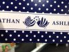
Font looks like a Garamond to me. Whatfontis is telling me URW Garamond Extra Narrow Unsure of the bird image. Might just need to recreate that one.- JBusch260
- Post #2
- Forum: Fonts and Typography
-
-
Font ID please
Ah I gotcha. Sorry, I'm not having any luck here. Hopefully somebody else will.- JBusch260
- Post #4
- Forum: Fonts and Typography
-
Font ID please
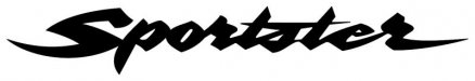
Here's a link for a vector you can work with. Not sure about font though, most likely custom, but don't quote me on that. http://www.brandsoftheworld.com/logo/harley-davidson-20- JBusch260
- Post #2
- Forum: Fonts and Typography
-
lil help please ..
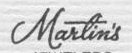
Nothing here. Most likely a hand drawn rendering.- JBusch260
- Post #4
- Forum: Fonts and Typography
-
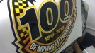
font ID
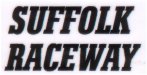
Whatfontis.com gave me Karnak Pro Cond Black Italic font- JBusch260
- Post #3
- Forum: Fonts and Typography
-

Olive Garden Font
Their logo? The subtext? The menu? The food descriptions? Can we get a picture?- JBusch260
- Post #2
- Forum: Fonts and Typography
-
Laminator disaster
Sorry I should have worded that better. Ours gets reverse loaded, but if I have issues of those waves, sometimes advancing the feed (by giving it a lot of slack) straightens it up. But that's in cases of slightly crooked loading or if the material shifted oddly on the roll.- JBusch260
- Post #42
- Forum: Laminators
-
-
Laminator disaster
Hmm.... that is a bummer.. if you advance the feed roll, does it still get bunched up like that? Could be an uneven pressure issue on the rollers as well.- JBusch260
- Post #37
- Forum: Laminators
-
From Portugal
Greetings from Ft Wayne, Indiana, USA!- JBusch260
- Post #3
- Forum: New Member Introductions
-
-

New member from Columbia SC
Greetings from Ft Wayne, Indiana!- JBusch260
- Post #15
- Forum: New Member Introductions
-
Hello from Spain!
Greetings from Ft Wayne, Indiana, USA!- JBusch260
- Post #4
- Forum: New Member Introductions
-
-
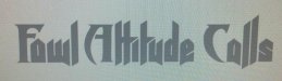
Font Help
The capital letters are Abaddon. Not sure about lower case.- JBusch260
- Post #2
- Forum: Fonts and Typography
-
New Member for Western Canada
Greetings from Ft Wayne, Indiana, USA!- JBusch260
- Post #4
- Forum: New Member Introductions
-
One of our designs made it on a Super Bowl Commercial.
Wow, too cool Joe! Congrats to you and your family!- JBusch260
- Post #3
- Forum: General Chit-Chat
-

-
Font Help Please
Actually, here's a really interesting article about that sign that I thought the forum might enjoy. http://articles.southbendtribune.com/2013-01-02/news/36118134_1_sign-painter-copyright- JBusch260
- Post #3
- Forum: Fonts and Typography
-
Font Help Please
I'm leaning on hand-drawn. There are a few subtle differences in the common letters. Plus, wasn't that hand painted on the wall at Notre Dame? Maybe a fan made a font based on it, but I'm not coming up with anything.- JBusch260
- Post #2
- Forum: Fonts and Typography