-
I want to thank all the members that have upgraded your accounts. I truly appreciate your support of the site monetarily. Supporting the site keeps this site up and running as a lot of work daily goes on behind the scenes. Click to Support Signs101 ...
Search results
-

Goofy font....what is it?
I'll bet he'd tell you really quick if you told him you were going to charge him for the amount of time it took to find this font. I'll keep poking around, this thing is going to drive me bonkers. I know I've seen it before somewhere. Any other photo examples??- JBusch260
- Post #8
- Forum: Fonts and Typography
-
-

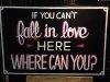
Blackberry Smoke
No problem! That guy's stuff is incredible. Post photos of what you come up with! Enjoy- JBusch260
- Post #10
- Forum: Fonts and Typography
-
Goofy font....what is it?
Closest I got was Duo Line and that definitely isn't it. Sorry!- JBusch260
- Post #6
- Forum: Fonts and Typography
-

A great place to start
For me, and I'm sure others, a challenge on font identification is a nice part of my day. I enjoy helping out while exercising my personal skills for better identification. If you find it to be a bother, don't respond to them. There are plenty of people that will pick up the slack.- JBusch260
- Post #5
- Forum: Fonts and Typography
-
Blackberry Smoke
Cool photo! Looks hand drawn to me. Here's the gallery for the guy that designed that logo. http://www.behance.net/gallery/letters-letters-letters/6106875- JBusch260
- Post #2
- Forum: Fonts and Typography
-

-

anyone recognize the fonts on these shirts?
The back is Corleone. Front is too small for me to tell. http://www.dafont.com/corleone.font- JBusch260
- Post #3
- Forum: Fonts and Typography
-
Attention Americans
Mosh, you are doing a great service for your country.- JBusch260
- Post #2
- Forum: Entertainment, Humor and Spoofs
-

Horrible design for drug task force patch
That looks like something Pantera would have sold at a merch table back in the 90s.- JBusch260
- Post #3
- Forum: Designs & Layouts
-
Hey would you at that, there are people in atlantic Canada!
Welcome from Ft Wayne, Indiana, USA!- JBusch260
- Post #2
- Forum: New Member Introductions
-
Our Process for Building a Brand
Made sure to bookmark that one! Thanks so much for the share Dan. Your work is fantastic.- JBusch260
- Post #7
- Forum: Logo Design
-

Some help please
DJ Kidplay Madness Preteen Shockheaded the unseen those are some of the suggestions Whatfontis.com gave me Hope that helps!- JBusch260
- Post #4
- Forum: Fonts and Typography
-
Some help please
Looks hand drawn. The 3 T's are all different.- JBusch260
- Post #2
- Forum: Fonts and Typography
-

Font ID
Closest I'm seeing is Aero Matics Display Bold, but stretched. Probably not it, but may help if you need to alter. Edit: I stand corrected. J Hill's suggestion looks much more accurate.- JBusch260
- Post #3
- Forum: Fonts and Typography
-
Old fashioned in KY..
Greetings from Ft Wayne, Indiana! Looks like you've got some talent. I like your work, especially that killer record store sign!- JBusch260
- Post #11
- Forum: New Member Introductions
-

-
-
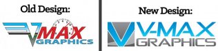
Old VS New - Need Critiques!!!
Have you done any revisions, with the suggestions posted above, that you could share?- JBusch260
- Post #17
- Forum: Logo Design
-
Long time fan, now a memeber from Atlanta
Welcome back from Ft Wayne, Indiana!- JBusch260
- Post #4
- Forum: New Member Introductions
-
Old VS New - Need Critiques!!!
I don't personally see the W there. I wouldn't mind seeing a new version with less gradients though. Perhaps a bit of space between the icon and busines name would help also. But as for that old logo, I thought something about it looked familiar. Van Halen called and they want their V back.- JBusch260
- Post #5
- Forum: Logo Design