-
I want to thank all the members that have upgraded your accounts. I truly appreciate your support of the site monetarily. Supporting the site keeps this site up and running as a lot of work daily goes on behind the scenes. Click to Support Signs101 ...
Search results
-
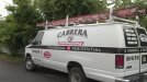
Some recent trucks
I'm not feeling Cabrera's phone number or rear window type treatment. Other than that looks great.- nikdoobs
- Post #6
- Forum: Portfolio Board
-
-
Why would you do that?
- nikdoobs
- Post #20
- Forum: Dimensional Signs
-
Why would you do that?
We've lost quite a few customers because we refuse to "refurbish" an existing sign. You try to explain to customers that it will be faster, easier, and look better to create a new sign and they don't get it. Its amazing how cheap and stupid customers are.- nikdoobs
- Post #18
- Forum: Dimensional Signs
-
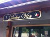
Why would you do that?
Have you tried the lasagna @ Dolce Vita?- nikdoobs
- Post #11
- Forum: Dimensional Signs
-
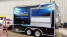
First Trailer Wrap
Hopefully these guys hold up their end of the bargain. I have a friend who works there so I trust she will take care of us. They are coming out next week to film us installing reverse lit Channel Letters at a Hospital for our TV commercial.- nikdoobs
- Post #8
- Forum: Vehicle Wraps
-
First Trailer Wrap
3m Controltac Vinyl and Laminate. Also 3m 1080 Brushed Aluminum for the logo.- nikdoobs
- Post #6
- Forum: Vehicle Wraps
-
First Trailer Wrap
I initially designed it with their logo in 3-d which I thought worked well with the background lights. It took a lot of time to photoshop the smoke/lighting effects. I was pretty upset when they told me they just wanted a flat logo, but I had to go with what they wanted.- nikdoobs
- Post #2
- Forum: Vehicle Wraps
-
First Trailer Wrap
We did a trade out with a local media station network for TV and Radio Ads. This sports radio station will be parking this outside of various sporting events and broadcasting live from inside the trailer (mainly doing pregame shows for University of Louisiana football games). It will be parked...- nikdoobs
- Thread
- Replies: 7
- Forum: Vehicle Wraps
-
-
Thoughts on my logo? Thoughts on the name?
Your logo is good but your brand identity is where you should be concerned. In Louisiana George Rodrigue's blue dog art is everywhere. That Blue Dog Cafe is right down the road from me in Lafayette. Your brand identity wouldn't work here but it may work in Texas.- nikdoobs
- Post #81
- Forum: Logo Design
-

Where can I order extra wide aluminum?
I need to order .040 white that is longer than 12' wide. Anyone have a supplier they use? TIA, Nick- nikdoobs
- Thread
- Replies: 3
- Forum: Product and Supplier Referrals
-
Dust is our biggest enemy
We use automotive tack cloth quite often.- nikdoobs
- Post #9
- Forum: General Signmaking Topics
-
What material for an ice chest logo?
3m and Arlon have new vinyl products that stick to bricks. That may work.- nikdoobs
- Post #6
- Forum: General Signmaking Topics
-

-
Font ID Please...
The u and the n look like LSU's Geaux Font but I'm pretty sure that's not it.- nikdoobs
- Thread
- Replies: 2
- Forum: Fonts and Typography
-
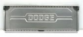
-
Old Dodge truck Font
- nikdoobs
- Post #15
- Forum: Fonts and Typography
-
Translucent Yellow vinyl or Yellow Acrylic?
+1 to Acrylic- nikdoobs
- Post #3
- Forum: Electric Signs & Channel Letters
-
Edge Cap Cutters
I'm looking for the cutters that cut alumalite edge cap at a 45 degree angle so its easy to go around corners. Anyone know where to direct me?