-
I want to thank all the members that have upgraded your accounts. I truly appreciate your support of the site monetarily. Supporting the site keeps this site up and running as a lot of work daily goes on behind the scenes. Click to Support Signs101 ...
Search results
-
Kinda like Technical/Tekton
Don't bother using WhatFontIs or WhatTheFont, I've exhausted them.- Colin
- Thread
- Replies: 1
- Forum: Fonts and Typography
-
-

font help
Berkely Retrospective or "Oldstyle" for the title. Helvetica/Swis for the lower text.- Colin
- Post #2
- Forum: Fonts and Typography
-
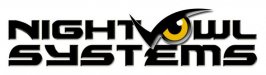
Night Owl Logo
Hey! Tyler Texas! Does the charletan R.W. Schambach still live there?- Colin
- Post #47
- Forum: Logo Design
-
-
-
Font Help Please
LYONS looks like Antique Olive Nord with the L modified. ?- Colin
- Post #2
- Forum: Fonts and Typography
-
Night Owl Logo
^^^ Cool! Neat employment of a mechanical element into the owl.- Colin
- Post #39
- Forum: Logo Design
-
-
Bacon
No, free range means that the animal is free to move in a more near-natural environment, and more importantly not subjected to a life of unimaginable suffering and cruelty due to the fact that "we like the taste". It is known that pigs are highly intelligent, social creatures, and hopefully...- Colin
- Post #79
- Forum: General Chit-Chat
-
Bacon
Too bad that the US's unnecessarily heavy meat-based diet has resulted in the horrifically cruel factory farms of all sorts. This is where your bacon comes from.- Colin
- Post #76
- Forum: General Chit-Chat
-

How do we compete with this?
I kinda thought the embedded humour in that comment might get lost.- Colin
- Post #62
- Forum: General Signmaking Topics
-

-
Night Owl Logo
1) Go back to your first design. 2) Reduce the size of the left part of the eyebrow. This will help it not look like a V. 3) Increase the space between NIGHT and OWL slightly. 4) Fix the horrible kerning in SYSTEMS.- Colin
- Post #23
- Forum: Logo Design
-

Font help needed
Lots of possibilities. They may have started with a font which didn't have the spaces and added them. (?) - Unionform - Poitec Bold - Macaroni - Alphaville - Blaster Infinite - Design System A-700 R - Fragma - Logan Five Bold - AF Generation AZ Semi Bold- Colin
- Post #2
- Forum: Fonts and Typography
-

font help please
That's not the first time he's been told that. :ROFLMAO:- Colin
- Post #5
- Forum: Fonts and Typography
-

Anyone know this one?
Pussycat or Eight Track are very close.- Colin
- Post #2
- Forum: Fonts and Typography
-
phone book
Just got our new phone books today, and they are a full half-inch thinner than last year.- Colin
- Post #42
- Forum: Sales, Marketing, Pricing Etc.
-
How do we compete with this?
C'mon Gino, you're not validating my belly-aching! :Big Laugh The thing I guess that frosts me is that there's more & more encroachment into the sign business by essentially big-box stores who are happy to make $10.00 on a banner. And they do take away a lot of business, because few people...- Colin
- Post #53
- Forum: General Signmaking Topics
-
How do we compete with this?
Unfortunately the people buying this stuff do compare, and when it's half the price (or more), we all know where they go.- Colin
- Post #48
- Forum: General Signmaking Topics
-
How do we compete with this?
I suggest that most all of us in the sign business think relatively small. The question to ponder is: "How can it be that everyone thinks big?" Wouldn't that "big thinking" just become the norm, forcing yet another leap in thinking size, along with even lower prices?- Colin
- Post #46
- Forum: General Signmaking Topics