-
I want to thank all the members that have upgraded your accounts. I truly appreciate your support of the site monetarily. Supporting the site keeps this site up and running as a lot of work daily goes on behind the scenes. Click to Support Signs101 ...
You are using an out of date browser. It may not display this or other websites correctly.
You should upgrade or use an alternative browser.
You should upgrade or use an alternative browser.
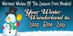
A Sign for the holiday season.
- Thread starter zmatalucci
- Start date
Pat Whatley
New Member
There shouldn't be a comma after "Wonderland to"
Other than that it's a nice clean layout.
Other than that it's a nice clean layout.
zmatalucci
New Member
yeah, customer just made me change it
Typestries
New Member
Very nice!
bob
It's better to have two hands than one glove.
Bottom white panel has customers name,, blocked out for obvious reasons.
Just a coroplast 4-8..
Do not change type faces in the middle of a thought.
Either that or reduce the two lines about the wonderland to a preface style tag line and increase, and please please no matter what change the type face, on the line with the bullet items.
As it stands right now, it's jarringly discordant.
Deaton Design
New Member
Looks great. Very Christmasy, seasonly. I like the use of the panel at the top also.
visualeyez
New Member
I think the word "Avalon" should be the first read and integrate with the company's graphic identity. Then "shop dine stay" should be your second read, with the third read being "warmest wishes of the season" and/or "your winter wonderland to".
You want people to see the Avalon sign/building and then shop/dine/stay... in the winter wonderland that grants warm wishes. I would personally get rid of the warm wishes part alltogether.
When I look at your layuot, my eye naturally flows to largest whitest graphic element, the snowman (arguable). His warm belly leads me to the winking eye, looking to his broom(wtf?) which then flows up and leading the eye to " Your Winter (nice and bright)" followed by darker less contrast/visibility "Wonderland to" and then you have to figure out if you want to read the top or the bottom, because they are both the same font, height, and weight, different than the copy before the irrelevant comma.
Christmas colors are red and green. The blue background does have a cool feel, but not what you want for the season. White letters pop off both red and green, especially if you use your nicely shown gradient/fountain fills (with no BLACK shadows) on each.
A font such as Dom Casual Bold would work well for this.
The snowman and "ice" would also contrast nicely with red or green
But that's my opinion and I don't know where the banner is being placed etc...
-Keith
