• I want to thank all the members that have upgraded your accounts. I truly appreciate your support of the site monetarily. Supporting the site keeps this site up and running as a lot of work daily goes on behind the scenes. Click to Support Signs101 ...

Am I overthinking?

MP Custom

New Member
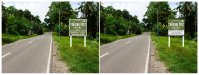
Hi All. I have been given this logo to be used for a few 2000mm x 2000mm Signs. The think is that the signs are on the side of the road in a bushy area.
I feel that the pastel green will be lost among the greens that are already in the surroundings. Unfortunately , the client is adamant that these are the colours she wants.
Thoughts? Or any suggestions to make it stand out a little bit better?
Thank you!
 

Attachments

  • mw.png
    mw.png
    124.1 KB · Views: 309

MP Custom

New Member
It's alot of info for a side of the road type of sign...but you can only do what you can do. Add a black outline to the top logo
It is such a messy logo. I will try different outline widths. I even tried a drop shadow, But Neh.. I just can't get enthused with this job.. Sigh
 

visual800

Active Member
take picture of area where sign is going and place sign there. The signs needs a white border to stand out from matching vegetation behind it. All that nonsense at the bottom is uncalled for. Even after doing the layout below I couldnt read any of the crap you were presented. Do a side by side and ask them "which one catches your eye first?" If they are adamant about their original design get all money down and start the job......you did the best you could, thats how I would handle it

When you click on image below you can immediately tell which one is readable and to the point
 

Attachments

  • mw.jpg
    mw.jpg
    1.1 MB · Views: 199

unclebun

Active Member
If the store were an REI store would you tell them that the forest green of their logo makes it not visible and you think it should be pink or something to stand out from the vegetation?
 

Geneva Olson

Expert Storyteller
Make it exactly how they want it. I have given up trying to convince people otherwise. One guy wanted dark blue graphics on a charcoal gray shirt with no white outline around it. He paid top dollar for screenprinted shirts that look like poopoo. He's happy as a loon and no one can see his company logo on his shirts.
 

Gino

Premium Subscriber
Needs more border............. I have a fever and only more border will help it.

Also, when making a laundry list like that, do it right. You're not writing in sentence form, so you don't use punctuation. If you hafta list all that unnecessary crap, make it bullets, not commas........................

Is it handmade or homemade..... or both ??

That sign is putrid for lotsa reasons and not just poor color choice.
 

Stacey K

I like making signs
Oh ya, I didn't see the second pic lol...I'm not sure what a light meal is. Maybe just stick with bullet points. When I see the word Jam and Pickles I think of local people making those items. When I see handmade products I think of crafts - not crafts but I can't think of the right word

Breakfast • Lunch
Sauces • Jams • Pickles
Fuel • Groceries

or
Local Preserves & Crafts (another word for crafts, goods...IDK) I can picture what is in the store but it can be explained in less words.

Just brainstorming while eating my lunch...light lunch since it's a salad LOL
 
Top