• I want to thank all the members that have upgraded your accounts. I truly appreciate your support of the site monetarily. Supporting the site keeps this site up and running as a lot of work daily goes on behind the scenes. Click to Support Signs101 ...

Business Card

Circleville Signs

New Member
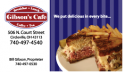
OK. Client is a local cafe/coffee shop. They wanted a new logo that was clean and "old" feeling. So, knocked that out. They loved it. I'm working on the business cards now, and I'm trying to steer them to a blend of modern and old. This is what I've got so far. Before I show it to them, I thought I'd get ya'lls opinions.


Gary
 

Attachments

  • Gibsons_BC.png
    Gibsons_BC.png
    42.7 KB · Views: 131

HaroldDesign

New Member
That's nice. Would the background of stripes look good using the company colors? It seems like it needs the red on the left to carry through.
 

Circleville Signs

New Member
Thanks for the comments all!

I will try it with the burgandy stripes. I used the blue from the edging of the logo - trying to pull that out some.

On the "ad vs. business card" issue, i agree! However, they wanted something that would jump out and make people hungry. My favorite thing on their menu is their rueben. So, there it is :)

Gary
 

Jillbeans

New Member
Maybe try some sort of interactive drop shadow behind the sandwich so it looks like it's not just pasted there.
And enlarge the logo, bringing it over on top of the stripes and moving it closer to the sandwich, even if it throws off your evenness with the other info.
I love Reubens, but am allergic to them.
Love....Jill
 
Top