You are 100% correct. Colour Matcher Pro is designed to help you create a
personal, physical reference, not a universal one. The entire philosophy behind it is that
the most accurate color measurement tool you own is your production printer, running your specific media and RIP profiles. The app is built to leverage that, not fight it.
Your spreadsheet system is exactly what savvy professionals do to manage the inherent chaos of CMYK printing between different setups. Colour Matcher Pro is designed to be the next evolution of that personal reference system, addressing scenarios that go beyond a simple list of Pantone values.
Here’s a deeper look at how it's different from built-in RIP tools and how its main features are designed for real-world print shop challenges.
How It's Better Than In-Built RIP Swatch Tools
RIP swatch generators are fantastic for one specific task: printing a big, static library of
known colours. Our app is designed for the messy, day-to-day job of
matching an unknown colour and doing it quickly from your design station.
- Design-Time vs. Print-Station Tool: RIP tools require you to go to the RIP station, generate a chart, and then take it back to your desk. Colour Matcher Pro is a web app you use at your design computer. You generate a targeted grid, download the CMYK PDF, and send it to your printer from your chair, integrating the process into your design phase.
- Interactive Exploration vs. Static Charts: A RIP chart is a static, "dumb" printout. The app's grid is fully interactive. When you find the perfect match on your physical print, you use the Coordinate Picker to instantly get the source CMYK data back into your design workflow. No manual searching, no typos.
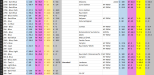
- Precision Hunting vs. Library Printing: If a client's sample is a slightly "off" blue, you don't need to print 500 blues. You generate a focused 9x9 grid of subtle variations right around the colour you think is closest. It’s a surgical approach that saves a huge amount of ink, media, and time.
In-Depth: The Image Extractor
This tool is built for a common headache: a client gives you a file that isn't production-ready.
- For Raster Images (JPG, PNG): A client sends a blurry photo or a low-res logo. You upload it, and as you move your mouse over the image, a real-time "loupe" follows your cursor, showing you the exact CMYK values of the pixels underneath. When you see the colour you want, you click, and it's instantly added to a printable test strip.
- For Vector Files (SVG - Pro Feature): A client sends their logo as an SVG. Instead of you having to open it in Illustrator and manually select every shape to find the colours, the app's AI parses the entire SVG file. It extracts every unique fill and stroke colour and presents you with a clean, complete palette. You can then add any of these official brand colours to your test strip with one click.
- AI Gradient Detection (Pro Feature): A client provides a beautiful photo (like a sunset) and wants its colours for a background. Manually recreating that smooth gradient is nearly impossible. The AI analyzes the image, identifies the most prominent multi-step colour fades, and presents them as ready-to-print gradient strips. It shows you the key CMYK "stops," which you can then print as a continuous-tone CMYK test strip to see exactly how your system handles those smooth transitions.
In-Depth: The Colour Tracker & AI Suggestions (Pro Feature)
This is where the app becomes an intelligent partner. It acts as your business's central "colour memory" and actively helps you make better decisions.
It's a super-powered database. For every colour you save to a job, you're not just saving CMYK values. You're storing the entire context: the printer used, the media, the rendering profile (GRACoL/FOGRA), and timestamped notes ("Client loved this one," "A bit too dark on matte vinyl").
This enables Proportional Update Suggestions. Imagine this real-world scenario:
- You have two jobs, "Client A - Van Wrap" and "Client B - Shop Fascia," both using a similar deep corporate blue.
- For Client A, you switch to a new vinyl, and the blue prints a little too vibrantly. You edit the colour entry for "Client A," reducing Cyan by 5% and increasing Black by 2% to get the perfect match.
- The next day, you open the job for "Client B." The Colour Tracker will now display a suggestion:
"AI Suggestion: Based on your recent update to a similar blue in 'Client A - Van Wrap,' we suggest a proportional update for this colour."
The app calculated the
delta (the C-5, M+0, Y+0, K+2 change) from your first adjustment. It then found a similar colour in another job and applied that same delta to create a new,
suggested CMYK value. It predicts that you'll likely need to make a similar adjustment for other, similar blues on that printer.
The same principle applies when you change a printhead. The Colour Tracker includes a built-in colour calibration strip, which can be printed to update the tracker’s internal colour data. Once updated, the system will automatically recommend colour adjustments based on the latest output—on a per-device basis. This ensures that existing colours for jobs on other printers remain unaffected.
Importantly, you're never asked to trust it blindly. Each suggested colour comes with a “Print Grid” button. Clicking this sends the AI’s recommended colour to the center of the Grid Generator, surrounding it with a tight cluster of nearby variants. You can then print this focused mini-grid to visually confirm accuracy before making any final decisions.
This strikes a balance between the speed of AI-powered adjustments and the precision of your professional judgement—transforming your past work into a predictive, intelligent asset for future jobs.
Why I Built This
I want to be upfront: I created this tool to solve my own daily frustrations on the print floor. Juggling RIP settings, matching client samples, and switching between different media felt like an exhausting cycle of guesswork, trial, and wasted materials.
Since integrating this tool into my workflow, the colour-matching process has become dramatically faster and more reliable. In nearly every case, I now hit the exact colour I need on the very first print.
For the best possible results, I strongly recommend printing the built-in
CMPTone® Swatch Book (a Pro feature) on your most commonly used media—with colour correction turned off. This gives you a physical, accurate reference of hundreds of colours
on your own machine, providing a solid, trustworthy base to work from.