• I want to thank all the members that have upgraded your accounts. I truly appreciate your support of the site monetarily. Supporting the site keeps this site up and running as a lot of work daily goes on behind the scenes. Click to Support Signs101 ...

Can you decode this logo?

signbrad

New Member
It's not necessary that a logo "mean" something. The purpose of a logo is merely to identify, nothing more.

What does the Toyota logo mean? It means nothing, at least not to the average viewer. In reality, it is filled with meaning. But the symbolism was no doubt for the benefit of stockholders and Toyota executives. Not necessarily for the general public, or the car-buying public. Yet, now, no one thinks anything remarkable about the Toyota mark. Yet you could probably arrive at all sorts of weird meanings for it if you look at it long enough. Is that a cow? Or someone wearing a sombrero?

Think about the Target logo, the "bullseye." What possible connection does it have to "discount department store?" Imagine what Target executives thought about the logo when they first saw it. Could they have said, "Wait a minute, we're not an archery store!" Or, "My 11-year-old could have designed this!"
What does the Nike swoosh mean? Or Apple's apple? They mean nothing, at least, they meant nothing when first designed. Apple's logo is simply a play on words, as is the Target logo. Now, or course, these marks are filled with meaning, after years of public association with the brands. So, what really makes for a good logo? Is it always about the design?

A logo must be recognizable, easy to remember. It must be legible, and legible at all sizes. It is usually simple, but not always (think about the multitude of colors in the American Shaman logo or the complexity of Budweiser's image of the upper case "A" and the eagle). A logo does not need to tell a story—it's purpose is merely to identify. In the words of author and designer, John McWade, it is a "corporate signature."
It helps, of course, if a logo is attractive.

But does a logo need to explain the company or its mission? No. It does not need to reveal what the company does for a living. It doesn't need any obvious connection with the company at all. What makes a logo successful is not necessarily the design. Rather, it is effective marketing and time. If a company is successful and its products are popular and in demand, it makes the logo look good. It's not the other way around.

Sometimes we designers try too hard when we design logos. We try to put too much in it. And we end up with something that doesn't work well. In fact, this is exactly what Rob Janoff (Apple logo creator) said about many young designers—they try too hard.

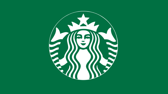
So, what about this coffee company logo? Is it a good one? Nobody seems to like it? I'm not sure I do, either. But that doesn't necessarily mean it will not stand the test of time. It is also good to remember that many logos are unpopular when first designed (Nike executives didn't want the swoosh, but they gave in).
If the coffee becomes popular and is well marketed, it will be successful, in spite of the strange-looking mark. If the company produces a junky product, or has bad service, or is poorly managed. it may fail. And a "cool" logo will not save it.

Brad
 

Attachments

  • toyota-badge.jpg
    toyota-badge.jpg
    137.3 KB · Views: 166

Adam Vreeke

Knows just enough to get in a lot of trouble..
Funny, I actually went over stuff like this in a graphic design class. The professor was real down to earth and told you how it was and didn't sugar coat anything. One day he pulled out an AIGA magazine (graphic design equivalent of SGIA) and help up the front page of an award winning design and said "lets talk about this". I tell you the design was fudging ugly; both the class and professor agreed. Long story short the moral of the story was sometimes you won't understand a design, but most of the time when you see it out in the wild, the customer screw-balled over the designer. Not sure which one is this though, might be both batters hitting with the wrong end of the bat from what it looks like.
 

Stacey K

I like making signs
Even if it has some meaning, my eye moves around too much trying to figure it out. I feel like there's 2-3 elements I'm looking at. At least with the Nike swoosh or the Toyota thingy, the eye isn't moving all over. I agree with Boudica - sad person or alien with a beauty mark.

Is it supposed to be one of those mind trick games...do you see the man or the woman first? LOL
1629729332648.png
 

unclebun

Active Member
Target's symbol is what their name is. A target. Apple's symbol is what their name is. An apple. These are the very best sorts of symbols, things which look exactly like what the name is. That's the purpose of the symbol, to represent the company. Easily. Toyota's symbol is a T made of two ellipses. A little abstract, but not as obscure as the old Mazda "toilet bowl" symbol. Mazda's new "seagull" symbol is a stylized M. McDonald's symbol is a stylized M representing the golden arches that came to be de rigueur at either end of their buildings.

The one presented for Nole Coffee could, with time and a lot of marketing, come to represent the coffee company, but I doubt it will get very far. It looks too much like an attempt at an alien language like Klingon or something. (No, it doesn't look like Klingon, but it does give me vague Star Trek ideas).
 
View attachment 155006
So a local coffee company contacted me for some signage.... This is their logo. WTF is it? They had a nice presentation from a design firm with three logo options but all three used this bug. I’ve seen the firms other quality design work so I’m 95% sure this logo was existing and the client wouldn’t let it go. WHAT DOES IT MEAN? Best I can come up with is a hand grabbing a cup, then a cup upside down.
looks like a graphic that was accidentally was ungrouped, then centered, lol. Or maybe it's some secret coffee society symbol. That takes the cake for unusual logo of the year.
 
View attachment 155006
So a local coffee company contacted me for some signage.... This is their logo. WTF is it? They had a nice presentation from a design firm with three logo options but all three used this bug. I’ve seen the firms other quality design work so I’m 95% sure this logo was existing and the client wouldn’t let it go. WHAT DOES IT MEAN? Best I can come up with is a hand grabbing a cup, then a cup upside down.
actually now that I look at it, it looks like the CBS "eye", broken apart
 

Patentagosse

New Member
I got a friend that was convinced that the more you pay, the better you get. Let's just say that I may be a novice/green/beginner designer (+32years in sign business) but after seeing a lot of "expensive" logos made by big marketing agencies, I doubt it's always "money well spent". Some of the best local brandings were in the 2500$ range for a nice design, recognizable and effective while some majors cities / manufactures have their corporative image made of Helvetica bold and spent 75-100k for it.
 

ActionGraphics

New Member
View attachment 155006
So a local coffee company contacted me for some signage.... This is their logo. WTF is it? They had a nice presentation from a design firm with three logo options but all three used this bug. I’ve seen the firms other quality design work so I’m 95% sure this logo was existing and the client wouldn’t let it go. WHAT DOES IT MEAN? Best I can come up with is a hand grabbing a cup, then a cup upside down.
Some John doing coke off a pregnant hookers stomach...
 

Pewter0000

Graphic Design | Production
My first thought was that it looked like a fat telescope with a fat tripod. And a ball on the ground.

But now that you've mentioned this:

looks like a graphic that was accidentally was ungrouped, then centered, lol. Or maybe it's some secret coffee society symbol. That takes the cake for unusual logo of the year.

Absolutely that. I make logos like this a lot by accident :D :cool:
 

signbrad

New Member
I've always thought the Starbucks logo to be somewhat peculiar. I'm sure it's filled with symbolism. But I
Starbucks evolution.jpg
would never have come up with a seafaring siren to represent a coffee company. Was the idea that it was seductive or addictive, like the coffee itself? The original logo was bare-breasted, after all.

The design certainly has become well known, probably the most recognized coffee logo in the world. The newest version has even dropped the wording, so iconic the design has become. How many logos can successfully stand alone naked like this (excuse the pun)?
And though I've always liked the design (I have a Starbucks cup), who would have thought that a two-tailed mermaid could become a world-famous symbol of a coffee company? And it's not cheap coffee, either. Garrison Keillor once called it "Tenbucks" instead of Starbucks.

There's a Starbucks off one of the bicycle routes here and sometimes I'll stop there when I ride. It's a nice rest stop, sipping on the patio with all the attractive students on their laptops. Can an old guy be hipster?

Brad
 

unclebun

Active Member
I've always thought the Starbucks logo to be somewhat peculiar. I'm sure it's filled with symbolism. But I View attachment 155057 would never have come up with a seafaring siren to represent a coffee company. Was the idea that it was seductive or addictive, like the coffee itself? The original logo was bare-breasted, after all.

The design certainly has become well known, probably the most recognized coffee logo in the world. The newest version has even dropped the wording, so iconic the design has become. How many logos can successfully stand alone naked like this (excuse the pun)?
And though I've always liked the design (I have a Starbucks cup), who would have thought that a two-tailed mermaid could become a world-famous symbol of a coffee company? And it's not cheap coffee, either. Garrison Keillor once called it "Tenbucks" instead of Starbucks.

There's a Starbucks off one of the bicycle routes here and sometimes I'll stop there when I ride. It's a nice rest stop, sipping on the patio with all the attractive students on their laptops. Can an old guy be hipster?

Brad
Quote from this article:
Other than the obvious “siren-call” allusion, why else would a coffee company start out with a sea beast as their logo? In short, Terry Heckler, the original sketch artist for the logo, wanted to go with a nautical theme because of the nautical-themed name of the company (“Starbuck” is the first mate in Moby-Dick). After weeks of research, Heckler decided on an old woodcut of a siren as his final inspiration. Thus was born the topless siren of Starbucks, and to this day 42 years later, Heckler cannot stop designing.
 
I've always thought the Starbucks logo to be somewhat peculiar. I'm sure it's filled with symbolism. But I View attachment 155057 would never have come up with a seafaring siren to represent a coffee company. Was the idea that it was seductive or addictive, like the coffee itself? The original logo was bare-breasted, after all.

The design certainly has become well known, probably the most recognized coffee logo in the world. The newest version has even dropped the wording, so iconic the design has become. How many logos can successfully stand alone naked like this (excuse the pun)?
And though I've always liked the design (I have a Starbucks cup), who would have thought that a two-tailed mermaid could become a world-famous symbol of a coffee company? And it's not cheap coffee, either. Garrison Keillor once called it "Tenbucks" instead of Starbucks.

There's a Starbucks off one of the bicycle routes here and sometimes I'll stop there when I ride. It's a nice rest stop, sipping on the patio with all the attractive students on their laptops. Can an old guy be hipster?

Brad
SignBrad, we are all young at heart! We call Whole Foods "Whole Paycheck" or "Whole Wallet", lol
 

Texas_Signmaker

Very Active Signmaker
I've always thought the Starbucks logo to be somewhat peculiar. I'm sure it's filled with symbolism. But I View attachment 155057 would never have come up with a seafaring siren to represent a coffee company. Was the idea that it was seductive or addictive, like the coffee itself? The original logo was bare-breasted, after all.

The design certainly has become well known, probably the most recognized coffee logo in the world. The newest version has even dropped the wording, so iconic the design has become. How many logos can successfully stand alone naked like this (excuse the pun)?
And though I've always liked the design (I have a Starbucks cup), who would have thought that a two-tailed mermaid could become a world-famous symbol of a coffee company? And it's not cheap coffee, either. Garrison Keillor once called it "Tenbucks" instead of Starbucks.

There's a Starbucks off one of the bicycle routes here and sometimes I'll stop there when I ride. It's a nice rest stop, sipping on the patio with all the attractive students on their laptops. Can an old guy be hipster?

Brad

He can be a creepster... Wear sunglasses so you don't get caught staring at the young college girls...
 

Notarealsignguy

Arial - it's almost helvetica
Weird logos are ego driven. They usually die with the company, not because the logo was stupid, but the ego driven attitude usually runs it into the ground. No soup for you.
 

Notarealsignguy

Arial - it's almost helvetica
I've always thought the Starbucks logo to be somewhat peculiar. I'm sure it's filled with symbolism. But I View attachment 155057 would never have come up with a seafaring siren to represent a coffee company. Was the idea that it was seductive or addictive, like the coffee itself? The original logo was bare-breasted, after all.

The design certainly has become well known, probably the most recognized coffee logo in the world. The newest version has even dropped the wording, so iconic the design has become. How many logos can successfully stand alone naked like this (excuse the pun)?
And though I've always liked the design (I have a Starbucks cup), who would have thought that a two-tailed mermaid could become a world-famous symbol of a coffee company? And it's not cheap coffee, either. Garrison Keillor once called it "Tenbucks" instead of Starbucks.

There's a Starbucks off one of the bicycle routes here and sometimes I'll stop there when I ride. It's a nice rest stop, sipping on the patio with all the attractive students on their laptops. Can an old guy be hipster?

Brad
I remember when coffee was a dirt cheap shit drink. I don't get the draw of it, especially with how expensive it is now.
 
Top