• I want to thank all the members that have upgraded your accounts. I truly appreciate your support of the site monetarily. Supporting the site keeps this site up and running as a lot of work daily goes on behind the scenes. Click to Support Signs101 ...

CD jacket design

Circleville Signs

New Member
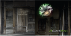
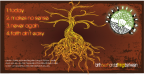
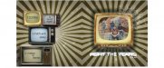
Hey guys - working on a CD jacket design for my band's new EP. We are just doing sleeves, so only a 2 panel. Here are the three I have come up with. Also, the titles are just placeholders. We haven't decided on a project name yet. This fold in the middle, so the image on the right is the "front" and on the left is the "back".

We are a a straight-up rock band.
 

Attachments

  • AlbumLayout1.png
    AlbumLayout1.png
    369.2 KB · Views: 127
  • AlbumLayout2.png
    AlbumLayout2.png
    312.7 KB · Views: 116
  • AlbumLayout3.jpg
    AlbumLayout3.jpg
    44.7 KB · Views: 92

Rick

Certified Enneadecagon Designer
Your band logo is overpowering every layout. The layouts are nice, the logo style is to "decorative". Either redo the logo, don't use it, or use it on the inside of the CD.
 

Circleville Signs

New Member
I agree on the left and middle ones Rick. Do you think it overpowers the right one as well? With it being the image on the static-y TV?
 

Rick

Certified Enneadecagon Designer
The one on the right may be the least distracted on, but there are issues with the logo. Mostly, hard to read, to complicated, there is probably a story to the image, but it's too ambiguous to understand it, and that problematic message overwhelms the logo.
 

Circleville Signs

New Member
Well - the logo is pretty set. We've been branding with it for a while, and a re-brand would cause some issues that i don't think we are ready to take on yet.

So, I tried something a bit different with the design on the right.

Thoughts?
 

Attachments

  • AlbumLayout4.jpg
    AlbumLayout4.jpg
    44.6 KB · Views: 118

Jillbeans

New Member
Post #8.
Logo on back behind the TVs.
In the round area created by the stripes.
Make image on front TV black & white.
Make stripes burgundy and deep red. Make name in orange.
And for the love of God man you need some rabbit ears on top of the back TV stack.
hahaha
Love....Jill
PS
Here is a local band whose cover art always pleases me:
http://www.clarksonline.com/discography/
 

Circleville Signs

New Member
Jill,

OK - suggestions taken and implemented - plus a couple of new thoughts on my end.

Whatcha think?
 

Attachments

  • AlbumLayout6.jpg
    AlbumLayout6.jpg
    45.3 KB · Views: 109

Rodi

New Member
Well - the logo is pretty set. We've been branding with it for a while, and a re-brand would cause some issues that i don't think we are ready to take on yet.

So, I tried something a bit different with the design on the right.

Thoughts?

I like left and right, hate the center one. What type of music? Do you remember the GodFathers, Birth, School, Work, Death? Your title reminds me of that.
 

signmeup

New Member
Looks a lot better. I think removing the 3D stuff from the name would help even more. Colons after the numbers would help too. Or some way to separate the number from the song title.....unless the title is, "4 Makes No Sense".
 

Jillbeans

New Member
Better, I would like to see the logo in a dark dark burgundy and I agree about losing the 3D effect on the name. I'd like to see the name in a bolder font, with a bit of distress, and in a deeper orange
Like your own logo first attempt color from the other day.
 

HaroldDesign

New Member
I like the last revision (post #14). As stated before, lose the 3D effect. Maybe just white. I also think it will look odd to have the bottom TV getting clipped off on the back.
 

Circleville Signs

New Member
OK - made a few more changes - Really didn't like the deep maroon for the logo on the back, so left it pretty much as-is.

Made the changes to the front though - thoughts?
 

Attachments

  • AlbumLayout7.jpg
    AlbumLayout7.jpg
    43.6 KB · Views: 87
Top