-
I want to thank all the members that have upgraded your accounts. I truly appreciate your support of the site monetarily. Supporting the site keeps this site up and running as a lot of work daily goes on behind the scenes. Click to Support Signs101 ...
You are using an out of date browser. It may not display this or other websites correctly.
You should upgrade or use an alternative browser.
You should upgrade or use an alternative browser.
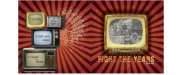
CD jacket design
- Thread starter Circleville Signs
- Start date
HaroldDesign
New Member
I really like it. Maybe make the Fight The Years on the front and the logo on the back the same color (whichever color that may be - I'm still thinking white).
Circleville Signs
New Member

HaroldDesign
New Member
Something about that yellow "Fight The Years" on the front really bothers me. What if you were to make it a color pulled from somewhere on that TV the copy is beneath?
Circleville Signs
New Member
HaroldDesign
New Member
It's only my .02 cents. 
I'd pick white from one of the knobs.
I'd pick white from one of the knobs.
animenick65
New Member
Love the last one!
Circleville Signs
New Member
Yay!!!!