-
I want to thank all the members that have upgraded your accounts. I truly appreciate your support of the site monetarily. Supporting the site keeps this site up and running as a lot of work daily goes on behind the scenes. Click to Support Signs101 ...
You are using an out of date browser. It may not display this or other websites correctly.
You should upgrade or use an alternative browser.
You should upgrade or use an alternative browser.
Cell phone sales
- Thread starter Marco
- Start date
Craig Sjoquist
New Member
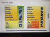
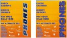
way wordy no one wants to read a book, dump all the brand name & logos
all ya need is.... check cashing...maybe money orders..,,bill payments.... did I see unlock phones
all ya need is.... check cashing...maybe money orders..,,bill payments.... did I see unlock phones
Marco
New Member


Craig Sjoquist
New Member
Here is a ad I did on 2 stores, one store they took it down after being up about 4 weeks.
Less then 1 week later they call me asking for the same ad same way & how fast because it worked so well they wanted it up now, which I re-did next day, happy customer indeed.
Note how little copy is.
Less then 1 week later they call me asking for the same ad same way & how fast because it worked so well they wanted it up now, which I re-did next day, happy customer indeed.
Note how little copy is.
Attachments


Marlene
New Member
the first on of the last idea looks OK. it is hard as there are way too many concepts. you have check cashing, bill paying, etc and then cell phones. does this all have to be on the same sign? there is no connection between the phones and the rest, maybe have one sign that has the other stuff and then the cell phone info? it kind of is like a restaurant sign with saw sharping, tooth pulling and a daycare, trying to make it all look cohesive.
Marco
New Member
we sell unlock phones?
Hushup.

Hushup.
Craig Sjoquist
New Member
I asked the same question ? ...we sell unlock phones VS we sell unlocked phones .... customer wanted unlock .. at $75 per hour in 2 hours finish cash in hand I do not argue
shoresigns
New Member
In other words, you're too lazy to do your job, which is give them a good design and justify any decisions you've made that are contrary to their instructions. If your customer is sitting in the director's chair making bad decisions and you're allowing it to happen, then you are not a competent graphic designer.The text is per client's request; not much I can do there.
graphicwarning
New Member
Is check cashing not supposed to be "Cheque cashing"? or is Cheque Canadian? eh?
Thats reserved for us eh... everyone else says "Check"!
")