-
I want to thank all the members that have upgraded your accounts. I truly appreciate your support of the site monetarily. Supporting the site keeps this site up and running as a lot of work daily goes on behind the scenes. Click to Support Signs101 ...
You are using an out of date browser. It may not display this or other websites correctly.
You should upgrade or use an alternative browser.
You should upgrade or use an alternative browser.
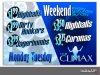
club banner
- Thread starter GraphixUnlimited
- Start date
TheSellOut
New Member
Looks pretty cool! Did you do the "Club Climax" logo...and I like your logo too!
SameDay Signs
New Member
I like it . I like the colors and as Heath said the logo is nice
GraphixUnlimited
New Member
thanks guys
yep we designed all of it, logo included hehe
cheers eh
yep we designed all of it, logo included hehe
cheers eh
Craig Sjoquist
New Member
It is a bit busy but does seem to work, more definition of eye movement is needed ,but not saying it would help sell better since high energy is needed to sell, so this might have a good balance of that / vs readability. looks cool
bayshorecreations
New Member
Only thing I don't like is your logo spelling... Just a peeve of mine really, I just hate the word graphics being spelled with an X.
Banner looks good!
$2.99 for dirty hookers? Is that an hourly rate? If so I'll take 2
Banner looks good!
$2.99 for dirty hookers? Is that an hourly rate? If so I'll take 2
GraphixUnlimited
New Member
Only thing I don't like is your logo spelling... Just a peeve of mine really, I just hate the word graphics being spelled with an X.
Banner looks good!
$2.99 for dirty hookers? Is that an hourly rate? If so I'll take 2
hehe we re just crazy like that!!
cheers eh :Canada: