-
I want to thank all the members that have upgraded your accounts. I truly appreciate your support of the site monetarily. Supporting the site keeps this site up and running as a lot of work daily goes on behind the scenes. Click to Support Signs101 ...
You are using an out of date browser. It may not display this or other websites correctly.
You should upgrade or use an alternative browser.
You should upgrade or use an alternative browser.
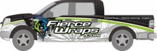
Company Truck Wrap Design
- Thread starter MichaelAlmand
- Start date
kbcgraphix
New Member
The grunge on the bottom makes the truck look like its dirty. Maybe try using the pattern thats in the black half instead.
Otherwise I really like it. Very nice.
Otherwise I really like it. Very nice.
MichaelAlmand
New Member
702 graphics
New Member
I like it
parkedcar
New Member
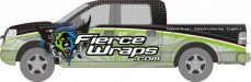
I like the first one better, but with the logo lowered.
I agree. Looks real nice though!
spectracolor
New Member
I like the first one as well~
Craig Sjoquist
New Member
likes the 1st one
instead of lowering logo... keeping the .com same size and position kern decrease size of fierce wraps with a possible bevel with green your using
yes it's clean and readable up close but a 1/2 block away worthless other then color
I do like your design/layout awesome really ...but unreadable at a distance
excuse I learned in sign school ... if you want to make look really nice ya bring the letters close together .. easy to do in print advertising works great
if you want it to be read and remembered ... you start at making it readable for billboard 1st by kerning the letters for equal and more space between letters
you can punch out the main copy with a bevel, shade, convex, blend what have you
just my 2 cents