-
I want to thank all the members that have upgraded your accounts. I truly appreciate your support of the site monetarily. Supporting the site keeps this site up and running as a lot of work daily goes on behind the scenes. Click to Support Signs101 ...
You are using an out of date browser. It may not display this or other websites correctly.
You should upgrade or use an alternative browser.
You should upgrade or use an alternative browser.
Crazy concept
- Thread starter ucmj22
- Start date
ucmj22
New Member
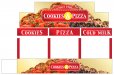
Try it without the rule lines and the stitch look likes at the border.
Try bringing the top elements down into the rectangle so you are not chopping off the scrolls.
Try the ampersand in gold so it's not so dominant.
This probably wasnt exactly what you were thinking but I like the previous version better, except for the gold ambersand, I think that works better.
Attachments

bob
It's better to have two hands than one glove.
This probably wasnt exactly what you were thinking but I like the previous version better, except for the gold ambersand, I think that works better.
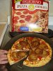
Are the selling ampersands or pizza and cookies?
Seems to me that everyone here is obsessing over a logo approach that tries to solve the issue when the real problem is
a) Does the business have good established branding? AKA "What Would Dan Antonelli Do"
b) Sell the concept with the wrap design itself, once branding is established
a) Does the business have good established branding? AKA "What Would Dan Antonelli Do"
b) Sell the concept with the wrap design itself, once branding is established
laserman70
New Member
Like it with the lines better.
JMHO
JMHO
ucmj22
New Member
Christian @ Visual Graphx
Active Member
yum tomatoes and chocolate!
ucmj22
New Member
Ditch the white on yellow. Might look good on your screen, but wont be able to see it from anything but close up.
That was kind of the idea. I wanted to downplay the ampersand and in turn put more emphasis on Pizza and Cookies.
Dan Antonelli
New Member
Seems to me that everyone here is obsessing over a logo approach that tries to solve the issue when the real problem is
a) Does the business have good established branding? AKA "What Would Dan Antonelli Do"
b) Sell the concept with the wrap design itself, once branding is established
He'd probably be amused at the weirdness of the business concept, but happy to quote them on the branding and vehicle wrap design. Soon after that, they'd be amused at the quote, thinking it was ridiculously high. Shortly thereafter, he'd be laughing, although simultaneously saddened, to see how they've probably wasted their money on a horrible design, and how they surely spent tens of thousands of dollars on a truck, design, yet thought spending a few grand to market it properly was a dumb idea.
And he'd see yet another poor small business owner hamstring their success by placing no value on their marketing of their business.
This is all just speculation of course, and has no basis in reality.
")
ucmj22
New Member
tens of thousands of dollars on a truck, design, yet thought spending a few grand to market it properly was a dumb idea.
a new 21ft concession trailer will set you back about 100K... and they still want it to look like a pink elephant threw up a family of clowns on it.
Dan Antonelli
New Member
a new 21ft concession trailer will set you back about 100K... and they still want it to look like a pink elephant threw up a family of clowns on it.
LOL - YEAH - THAT

TheSellOut
New Member
hMmm...Pizza and Cookies...
sounds like the making of a great milkshake!
sounds like the making of a great milkshake!
bayshorecreations
New Member

How come this is all I can picture?
lol....sorry nothing to add. Just funny as hell!!!