-
I want to thank all the members that have upgraded your accounts. I truly appreciate your support of the site monetarily. Supporting the site keeps this site up and running as a lot of work daily goes on behind the scenes. Click to Support Signs101 ...
You are using an out of date browser. It may not display this or other websites correctly.
You should upgrade or use an alternative browser.
You should upgrade or use an alternative browser.
Critic Magnet
- Thread starter Jackflush
- Start date
J Hill Designs
New Member
hmm
J Hill Designs
New Member
first one 

TheSnowman
New Member
I was thinkin' bottom.
Jillbeans
New Member
I prefer the bottom as well.
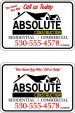
I don't like how the tagline is in the corner of the top one.
Here's a suggestion, not sure if the CONSTRUCTION had to be yellow.
I would not add the city and state as that is too much info on a small sign.
And I think an ellipsis is nicer than a slash.
Love....Jill
I don't like how the tagline is in the corner of the top one.
Here's a suggestion, not sure if the CONSTRUCTION had to be yellow.
I would not add the city and state as that is too much info on a small sign.
And I think an ellipsis is nicer than a slash.
Love....Jill
Attachments
auto accents sc
New Member
Hey Jill, I like that script . which font is that?
Jamey
Jamey
bob
It's better to have two hands than one glove.
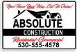
Jill's is a hell of a lot better but it's still a dreary looking thing.
If it were me, I'd drop the tag line, no one is ever going to read it much less care, de-emphasize the roof line by emphasizing the 'ABSOLUTE', make 'Construction' part of the name rather than some sort of add-on, and make a more effective use of color.
A quickie...
If it were me, I'd drop the tag line, no one is ever going to read it much less care, de-emphasize the roof line by emphasizing the 'ABSOLUTE', make 'Construction' part of the name rather than some sort of add-on, and make a more effective use of color.
A quickie...
Attachments

Jillbeans
New Member
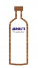
Bob sure cleaned things up.
I think maybe silver metallic would have looked nice rather than the red, but he prioritized it all quite nicely.
My font used (like most bob used) is from Arthur Vanson.
It's his newest, Flash Script.
I think maybe silver metallic would have looked nice rather than the red, but he prioritized it all quite nicely.
My font used (like most bob used) is from Arthur Vanson.
It's his newest, Flash Script.