• I want to thank all the members that have upgraded your accounts. I truly appreciate your support of the site monetarily. Supporting the site keeps this site up and running as a lot of work daily goes on behind the scenes. Click to Support Signs101 ...

Finished up a trailer

Stormyj

Just another guy
Hi all,
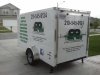
Finished this up today. Let me know what you think. Nothing fancy, simple lettering with shadow. Logo provided by customer. Came out good in my opinion and customer was happy. Constructive criticism welcome. Helps me improve.
IMG_20140526_180007.jpg

And a LOTO Board (shadow board) for a local chemical processing plant.
IMG_20140506_125615.jpg IMG_20140507_120049.jpg
 

Attachments

  • 10402557_247415175447287_6804833575480747968_n.jpg
    10402557_247415175447287_6804833575480747968_n.jpg
    52.7 KB · Views: 116

visual800

Active Member
You have 4 things there that do not compliment the other. Things they offer overpowers all the rest. Phone number shoved up above logo, then the logo which is absolutly horrible and then some crap under logo I didnt read cause by the time I got there what else did I posssibly need to know

a logo should flow, your eyes should go to, who, what, how to contact. On this my eyes went to what, who, phone and then glanced away cuase of interest loss. Horrible layout, horrible logo, next time keep it flowing
 

Attachments

  • image.jpg
    image.jpg
    55.2 KB · Views: 141
You definitely need to better prioritize your copy. The phone number shouldn't be the larger design element, the logo should. As it stands, the logo is the smallest and hardest to read element. This is a poor layout.
 

Stormyj

Just another guy
Thanks for the feedback. Will keep in mind for next project. How do you guys get the customer to lay off of the idea of having so much info put on their trailer. He wanted a lot of info and then an excruciating long catch phrase.

What you all think of the LOTO board.
 

Speedsterbeast

New Member
I personally think a trailer is an ok place to put a lot of info. They often sit at a clients house for the neighbors to read.
That being said, the phone number is wayyy to big. Clever name though
 

SignManiac

New Member
How do you guys get the customer to lay off of the idea of having so much info put on their trailer.

Education on your part and the customers part. You have to be able to communicate to the customer the importance of good design versus bad either through explanation or by example. A good design needs to be prioritized in order of importance. Letting the customer with no design experience tell you how to do your job, will always end with ugly work. In most cases...
 

TimToad

Active Member
I'd agree with all of the previous comments and don't want you to get discouraged. Dealing with insistent and demanding customers is as big of a skill to build as good design. The prioritization issues are huge.

I just finished a beat up old trailer job that I inherited from the shop owner I just bought out. It had the company name on it in some form or another 11 TIMES! It was so bad, I didn't take a photo of it , even for measurement purposes in case the guy wants to do another one. The customer was just a bear to deal with and in the end, you just do your best, try and use the example offered earlier by contrasting their lousy ideas next to your better concept.

Here is one for the local sewer department that I just finished and as simple as it is. I think it works. The acronym and the man hole cover are clearly the highest priority followed by the descriptive and lastly, the city logo.

REPORT Trailer small.jpg
 
Top