-
I want to thank all the members that have upgraded your accounts. I truly appreciate your support of the site monetarily. Supporting the site keeps this site up and running as a lot of work daily goes on behind the scenes. Click to Support Signs101 ...
You are using an out of date browser. It may not display this or other websites correctly.
You should upgrade or use an alternative browser.
You should upgrade or use an alternative browser.
Font Showcase
- Thread starter Floridaman
- Start date
AndersHerp
Something, something Dark Side
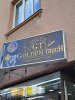
The longer you look at it, the worse the design becomes. I'm torn between someone purposely did this to troll other designers, or just an idiot putting things together.
The sign definitely looks like something baked by a committee. Different people all throwing in their little check list demands for what needs to be included on the sign face.
The "neon" woman and man icons at the left don't fit the tone of the salon "logo" at all. I'm guessing those were design requests made specifically for the sign face and that the terrible logo was a pre-existing element.
I guess whoever came up with the logo concept thought they were being clever by changing typefaces and color effects in "Golden Touch." The "gold" letters in "Golden" are made shiny looking. How amazing is that? The faked large capitals and small capitals treatment is clunky as hell. So many sans and serif typefaces these days have native large cap and small caps character sets (and variable fonts can let you fake such treatments more gracefully). Scissor and razor icons have long worn out their welcome on salon signs; yet they're an ingredient that seems to never die.
I have a strong feeling the graphics person who assembled this sign design was forced to shoe-horn all the client requests into a tight space and try to not throw up in his mouth while doing so.
The "neon" woman and man icons at the left don't fit the tone of the salon "logo" at all. I'm guessing those were design requests made specifically for the sign face and that the terrible logo was a pre-existing element.
I guess whoever came up with the logo concept thought they were being clever by changing typefaces and color effects in "Golden Touch." The "gold" letters in "Golden" are made shiny looking. How amazing is that?
The faked large capitals and small capitals treatment is clunky as hell. So many sans and serif typefaces these days have native large cap and small caps character sets (and variable fonts can let you fake such treatments more gracefully). Scissor and razor icons have long worn out their welcome on salon signs; yet they're an ingredient that seems to never die.I have a strong feeling the graphics person who assembled this sign design was forced to shoe-horn all the client requests into a tight space and try to not throw up in his mouth while doing so.
Boudica
I'm here for Educational Purposes
that hurts to look at.I just came across to this Beautiful example... couldn't resist not to share it