• I want to thank all the members that have upgraded your accounts. I truly appreciate your support of the site monetarily. Supporting the site keeps this site up and running as a lot of work daily goes on behind the scenes. Click to Support Signs101 ...

Help Needed with this effect

evader

New Member
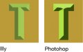
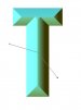
Wondering if someone could help me with how to create the effect used in "Game Time"...not really sure what it's called but I'm referring to the "chiseled" look in the word.

I thought I remembered seeing something somewhere once about it being done with the Interactive Contour Tool and I've been messing around with that for a little bit but I'm not having much luck.

I've tried searching the forum but it's hard to do when you don't really know what the effect is called...lol.

Any help would really be appreciated.

Thanks
 

Attachments

  • GameTime-Logo-wed.jpg
    GameTime-Logo-wed.jpg
    53.2 KB · Views: 160

Pete Moss

New Member
3D > Extrude and bevel > 0 rotation Bevel> complex four, move with direct select tool to get rid of extra plane.
 

TimToad

Active Member
The only problem I've encountered doing it in Illy like suggested is on really bold fonts, you can't really get to a full prismatic effect before your bezels self-intersect and overrun the edges of the letter.
 

Pete Moss

New Member
Tim called it. This effect is in Illustrator. I have not played with it other then to find it for this thread. Not sure, but I'm guessing you could copy the text, apply your effect, edit your chisel angles (similar to below), and paste the original text (without the effect) back and place it on the lowest layer.

Good question by the way. It's such a cool look. I wonder what most folks do to achieve this. I know there are some fonts out there, that have been mentioned in this site, with the chisel already built into it. After converting the font to curves, flattening and un-grouping I'd imagine it would be editable.
 

astro8

New Member
I use Xara to design all my signage, layouts and concepts, then export to Flexi, Enroute or Illustrator for production- I've found it by far the fastest vector drawing program.
Quick and dirty example using the intuitive bevel and contour tools...
 

Attachments

  • xara.jpg
    xara.jpg
    119.4 KB · Views: 112

TimToad

Active Member
attachment.php


This is the problem that I always encounter trying to use the features in Illy and Photoshop. I've rarely found a font that will produce an even, accurate, rendering of the center line convex, prismatic letter without some work involved afterwards hiding the computer's idiosyncracies and self-intersection issues.
 

Attachments

  • Prismatic T.jpg
    Prismatic T.jpg
    36.1 KB · Views: 114
  • Prismatic T.jpg
    Prismatic T.jpg
    36.9 KB · Views: 160

Chimuka

New Member
[QUOTETimToad
The only problem I've encountered doing it in Illy like suggested is on really bold fonts, you can't really get to a full prismatic effect before your bezels self-intersect and overrun the edges of the letter​
[/QUOTE]

I like the plug-in called Shinycore by path-styler. This plug in works from vectors so the problem you displayed is fixed
 

TimToad

Active Member
[QUOTETimToad
The only problem I've encountered doing it in Illy like suggested is on really bold fonts, you can't really get to a full prismatic effect before your bezels self-intersect and overrun the edges of the letter​

I like the plug-in called Shinycore by path-styler. This plug in works from vectors so the problem you displayed is fixed[/QUOTE]

attachment.php


Ok, so I downloaded the plugin and created this sample. While I'll admit I was able to eliminate some of the self-intersecting of the shapes and it does give you more latitude to adjust things, you can see at the intersection of the cross bar on top, it handled it exactly like the Illy and Photoshop do. And it isn't creating vector shapes that you adjust with the direct selection tool. I'll go back to the website and fully explore all the options and tools available. It certainly appears to be a good tool to add for anyone who adds effects to their text.
 

Attachments

  • T.jpg
    T.jpg
    567.3 KB · Views: 163

Chimuka

New Member
TimToad,

There is a control at the tip that is called joins. There are 3 selections. Try the far right one. After looking at the Illy rendering.it may be the same as that. For the convex points to line up perfectly in the center the strokes probably need to be the same width.
 

Attachments

  • convex 2.jpg
    convex 2.jpg
    13.4 KB · Views: 129
  • convex 1.jpg
    convex 1.jpg
    28.1 KB · Views: 116
Top