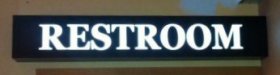
I need some help with identifying a typeface that looks very familiar, but isn't really. It looks kind of like a cross between Times and Century Schoolbook but with more of a slab serif feel. At first I thought someone merely artificially thickened Times to make it look more bold, but that's not really it. This is just a different typeface.
The attached image is from a customer supplied photo taken with a crummy phone, hence the low resolution. It certainly wasn't high enough to use at MyFonts "what the font" tool.
TIA for any help.
The attached image is from a customer supplied photo taken with a crummy phone, hence the low resolution. It certainly wasn't high enough to use at MyFonts "what the font" tool.
TIA for any help.