Stacey K
I like making signs
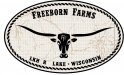
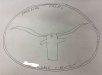
A farmer came in and had picture drawn EXACTLY the way he wanted his logo, font and all. So this is almost exactly like the pencil drawing. Anyway, he only wants it two color but wants me to add a leather or brass effect. Doing this is 2 color is horrifying. 3 color is better - but he only wants 2 color. I'm completely stuck on this, how am I supposed to do this? On the 2 color one I tried removing some of the black around the letters to make less clustered. Still looks like crap. The rest of the logo needs clean up but it's pretty much the way he wants it. Thank you!