• I want to thank all the members that have upgraded your accounts. I truly appreciate your support of the site monetarily. Supporting the site keeps this site up and running as a lot of work daily goes on behind the scenes. Click to Support Signs101 ...

How to age / weather a new sign...

tulsagraphics

New Member
Progress update:

So y'all know how, during the busy season, every day is a surprise party (usually not a welcome one. lol)... but I did manage to -- finally -- throw down more paint.

My first attempt, with zero thinner, took a friggin' week to "cure" (well, cured "enough" for a scuff + 2nd coat), but it managed to level itself out for the most part. Apparently I need to get some more Ronan additives for better flow and faster cure time. My follow up coats resulted in ripples / wavy stokes. Not great. I was not happy -- but then I got to thinking about it -- maybe these imperfections are actually ideal. After all, I'm attempting to replicate a 50 year old sign that's been repainted a dozen times.

Meanwhile, I noticed that thinning paint -- a few drops of turp per oz goes a LONG way (for better or worse) in how these enamels flow. Today was a good day. Pushing the brush out to beveled edges with minimal bleed. I hope it looks as good tomorrow as it does today. For some crazy reason we're back into the upper 30s -- in April(?) -- so I probably won't check tackiness tomorrow. But if it's dry enough I'll at least try to clean up all the red dust I managed to spread into the wood grain across 4 different aging attempts which I have since tried to sand / grind out, in favor of the swamp water. Oof. --- it's okay though. We. Are. Sciencing!
 

Attachments

  • 1776579217705.png
    1776579217705.png
    3.7 MB · Views: 8
Last edited:

tulsagraphics

New Member
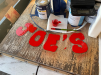
As you can see, this sample piece has plenty of issues. But... the silver lining... I'm learning very quickly what "NOT" to do -- and hopefully avoid these issues when I start the "real" sign.

- I'm still dialing in the paint/thinner ratio (the red didn't want to level out, but the blue is leveling very well -- even with the same paint/thinner ratio). I'm not mad at the red, as it does give some aged character.
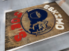
- scuffing in between coats -- which I "think" needs to be done(?) Well, it's causing paint dust to collect in the texture. I'm not sure how to deal with this problem, short of using a wire brush wheel on the Dremel (next to a vacuum hose), then carefully re-aging those spots (swamp water). You can see in the pic all those lighter spots where I started cleaning things up.
(I think this is another vote for painting the MDO before the CNC work, instead of after)
- As previously mentioned I'm trying to "remove" those original aged accelerators from the bottom of the sign -- not that it's critical, it is a test piece after all -- but I would like the prototype to look a little less janky, as I do plan on keeping the sign in my "showroom".
- These paints dry very thick, which is why I decided to paint the entire letters, then come back later for the white snow caps. The white MDO was stained anyway. I think it will look better with the snow cap being a total of 4 coats (2 white on top of 2 red) vs. the 2 coats of red on the letters, even if that dimensional texture is only noticeable at arms length.
 

Attachments

  • 1776637663187.png
    1776637663187.png
    4.3 MB · Views: 1
Top