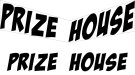
For the life of me I cant get a font (turned into outlines) to look symetrical when I envelope distort----use top object. Not sure if its me or the font itself doing it. Attached is a picture and you can see the "prize house" text doesnt look correct. Can anyone possible help figure out what I am doing wrong? Thanks
-
I want to thank all the members that have upgraded your accounts. I truly appreciate your support of the site monetarily. Supporting the site keeps this site up and running as a lot of work daily goes on behind the scenes. Click to Support Signs101 ...
You are using an out of date browser. It may not display this or other websites correctly.
You should upgrade or use an alternative browser.
You should upgrade or use an alternative browser.
Need Help Illustrator struggle
- Thread starter crny1
- Start date
Adam Vreeke
Knows just enough to get in a lot of trouble..
Few possible ways off the top of my head.
Try Type on a Path option, this will at least get you perpendicular to your baseline.
You can also use Effect > 3D and Materials > Rotate. Have plane selected and play with the Y and perspective.
Try Type on a Path option, this will at least get you perpendicular to your baseline.
You can also use Effect > 3D and Materials > Rotate. Have plane selected and play with the Y and perspective.
Thought about this option too but it needs to have that tapered look towards the center. Not sure you could do it with type on path.
Few possible ways off the top of my head.
Try Type on a Path option, this will at least get you perpendicular to your baseline.
You can also use Effect > 3D and Materials > Rotate. Have plane selected and play with the Y and perspective.
You could try to draw a box around each word then group the box with the word. Then perform the envelope distort and delete the boxes afterwards. Try to make the box the same size as the word it is grouped with.
If that fails, maybe just do a free distort on each word until it looks right.
If that fails, maybe just do a free distort on each word until it looks right.
I would definitely do each word separately like jochwat said.
If I were trying to make the font grow with the wider end of the chevron shape, I would start with a warp effect. I would use the default "ARC" because doesn't matter which effect as I would set the "Bend" value to 0 and adjust the horizontal "Distortion" value to fit the space. (I would probably skip this step and move on to the next step to see how it looked first, then come back to this step if I didn't like the results.)
Then I would go to the menu: Object > Transform > Shear and tick the "Vertical Axis" button then adjust the "Shear Angle" until it fit.
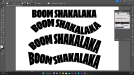
Envelope effects work okay in Illustrator. But I think Art Brushes work better in plenty of cases. In the attached sample image I turned a piece of text into an art brush and applied that brush to a path. The Width Tool in Illustrator can vary the stroke thickness. They're live effects and can be adjusted, perhaps more easily than the envelope effects. Sometimes I'll get the length of the target path and build my text object to fit the path's length more exactly when I want the most natural looking results (the letters won't be as squeezed or stretched).
In the attached sample image the bottom text string is a little odd where the bend occurs. But that's because it's just a single path. For better flow control the path can be broken in two at the corner point so two separate word art brushes can be applied to those paths.
In the attached sample image the bottom text string is a little odd where the bend occurs. But that's because it's just a single path. For better flow control the path can be broken in two at the corner point so two separate word art brushes can be applied to those paths.
Attachments
Last edited:
The Vector Doctor
Chief Bezier Manipulator
Nice trickEnvelope effects work okay in Illustrator. But I think Art Brushes work better in plenty of cases. In the attached sample image I turned a piece of text into an art brush and applied that brush to a path. The Width Tool in Illustrator can vary the stroke thickness. They're live effects and can be adjusted, perhaps more easily than the envelope effects. Sometimes I'll get the length of the target path and build my text object to fit the path's length more exactly when I want the most natural looking results (the letters won't be as squeezed or stretched).
In the attached sample image the bottom text string is a little odd where the bend occurs. But that's because it's just a single path. For better flow control the path can be broken in two at the corner point so two separate word art brushes can be applied to those paths.
The Vector Doctor said:Nice trick
Here's a better example (attached) of the art brush trick at work. Standard text on path effects just wouldn't work properly on this volunteer fire dept logo. The same goes for standard envelope effects. Using a variable version of TT Supermolot allowed me to adjust the width axis of the "volunteer fire dept" lettering so it would more gracefully match the same length as the target path.
The art brush approach isn't a perfect solution. Depending on the typeface or target path things can get looking wacky. However, I really dislike the jumbled look of standard text on path letters.
Attachments


Adobe Illustrator has a very good tool set. Another nice thing about Illustrator is all the 3rd party plug-ins available. A few are free. Others have to be purchased. Astute Graphics has a pretty incredible collection of Illustrator plug-ins. The company continues to improve and add to that collection of plug-ins. It's not cheap though, around $139 per year currently. The plug-ins can sure save a lot of valuable time though.
Also, it's tough to get an italicized font to look right in that type of space. Even if one side looks right, the other side will look skewed. If you must use that font and you can try "un-italicize" it using Object > Transform > Skew before attempting any of the ideas mentioned above should produce better results.