-
I want to thank all the members that have upgraded your accounts. I truly appreciate your support of the site monetarily. Supporting the site keeps this site up and running as a lot of work daily goes on behind the scenes. Click to Support Signs101 ...
You are using an out of date browser. It may not display this or other websites correctly.
You should upgrade or use an alternative browser.
You should upgrade or use an alternative browser.
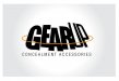
Initial logo idea - let the fun begin
- Thread starter Team Valhalla
- Start date

hcardwell93
New Member
I've had a gun shop for more than 6 years now, and I feel like I don't get a good feel of the business from the logo.
- Are you going to be doing brick and mortar, or online only?
- Do you have any thoughts of becoming an FFL in the future?
- Is your target audience absolutely any gun person, or geared more towards newbies, or towards Tommy Tactical?
- Is the name "Gear Up" absolutely set in stone?
- Are you going to be doing brick and mortar, or online only?
- Do you have any thoughts of becoming an FFL in the future?
- Is your target audience absolutely any gun person, or geared more towards newbies, or towards Tommy Tactical?
- Is the name "Gear Up" absolutely set in stone?
Pixels Are Bad Mmmkay?
New Member
YOU WANT AN ARROW?put it in the right place))))goudy bold font........i stretched the G down to the same level as the p......the U i moved it to the same level as the ear, bottom. added the arrow to the top of the U........GOUDY works well here..
Gaudy is more like it.
Pixels Are Bad Mmmkay?
New Member
I like your first concept but I would place the letters as to leave the G in the foreground to better show the arrow. I would also make the arrow less obvious and keep the G looking natural. It doesn't say much about the type of business, but it's simple and it works, the G just needed to be executed better and then it's no longer a little too much as someone else mentioned.

Attachments
I like your first concept but I would place the letters as to leave the G in the foreground to better show the arrow. I would also make the arrow less obvious and keep the G looking natural. It doesn't say much about the type of business, but it's simple and it works, the G just needed to be executed better and then it's no longer a little too much as someone else mentioned.
This one is the best so far except for the unusually tight letter spacing. I get the overlap and placing the G in the foreground, but it doesn't resemble an arrow anymore as much as it does a distorted G.
What if you opened up the spacing a little bit and welded all the letters except the G to each other.
Thank you for respecting the integrity of the secondary type's font. I cringe whenever I see perfectly good fonts squeezed or extended beyond their natural, intended usage. If your space only allows a condensed or extended font, PICK A FONT OF THAT TYPE! so you don't have to distort the natural letter forms too much.
hcardwell93
New Member

eahicks
Magna Cum Laude - School of Hard Knocks
YOU WANT AN ARROW?put it in the right place))))goudy bold font........i stretched the G down to the same level as the p......the U i moved it to the same level as the ear, bottom. added the arrow to the top of the U........GOUDY works well here..
Worse.
eahicks
Magna Cum Laude - School of Hard Knocks
I like your first concept but I would place the letters as to leave the G in the foreground to better show the arrow. I would also make the arrow less obvious and keep the G looking natural. It doesn't say much about the type of business, but it's simple and it works, the G just needed to be executed better and then it's no longer a little too much as someone else mentioned.
People Magazine is what first popped in my head.
Pete Moss
New Member
I think what jsmoritz did is awesome. I don't mind the tight kerning either. It's very legible and many well known logos use tight kerning, it adds character. I do think the little black spots can be deleted though. The arrow is still visible if it's pointed out which in my opinion makes it even better.

Attachments
Pixels Are Bad Mmmkay?
New Member
Since this post is 4 months old maybe the OP could show how the logo turned out.
Hahaha! I hadn't even noticed.
toucan_graphics
New Member
This is an old thread, but I played with it anyway. Got rid of the arrow idea (too cliche IMO). Simplified and staggered the text a bit and added an extractor. To most US Military types, the extractor is almost instantly identifiable and easily identifies this logo as dealing with tactical gear or shooting equipment.... to non-military types it helps reinforce the "gear" for brand identity as the extractor resembles a gear.

