Rick
Certified Enneadecagon Designer
I was about to post this before the thread was shut down and was convinced by my business partner to not let the opportunity pass...
While I still firmly believe that a design brief is necessary to give the client the best possible outcome, I believe we all do it in one form or another... I'm not going to debate how I do it or if it's the best way or only way, it was the way I was taught, so I'm passing on my experience.
We used to get these threads all the time where someone post a logo and we have to figure out what the client might have wanted with little to no information from the OP, and I'm doing this 3000 miles away... like I mentioned earlier, I can make pretty logos all day long, does not mean they are good for the client or that they will like it... most decent designers can do this.
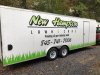
To the OP... Many points were touched on, what I did was look at what your client already has, and researched "LAWN CARE" and "LANDSCAPE" logos. I have designed quite a few lawn logos but I still look them up. I want to make sure I don't get into a habit of doing the same thing over and over again. What I am showing here are not works of art or the solution, just quick ideas.
Never design a logo for just truck doors, think of how it will be applied. At the very least, this client needs vinyl graphics, a flyer, business cards and t-shirts, it would also help to have their branding on their Facebook page. I always try to slap the logo on the clients other branding opportunities to see if the logo will work on all applications.
CONCEPT! You don't have to rack your brain on this, I simply went to the Facebook page and saw the mowing pattern and a light bulb went off in my head. I also just played with shapes, I have a bad habit of designing in a retro style, but since I am doing this for fun, I figured it would be ok...
I know someone might be curious, I did this in Illustrator, it took about 4 hours total... in the real world, I would never show this much to the client, they may get 2-3 ideas and it would take at least twice as long. If I were a sign shop, I would use every opportunity to sell whatever I could to the client, so business cards and yard signs would be included in the layouts.
By the way, Brad mentioned it and I agree, it takes a lot of guts to show your work, but we all had to at one point to get better at this... I hope you are not discouraged, we all start somewhere, just do your research and keep practicing...
While I still firmly believe that a design brief is necessary to give the client the best possible outcome, I believe we all do it in one form or another... I'm not going to debate how I do it or if it's the best way or only way, it was the way I was taught, so I'm passing on my experience.
We used to get these threads all the time where someone post a logo and we have to figure out what the client might have wanted with little to no information from the OP, and I'm doing this 3000 miles away... like I mentioned earlier, I can make pretty logos all day long, does not mean they are good for the client or that they will like it... most decent designers can do this.
To the OP... Many points were touched on, what I did was look at what your client already has, and researched "LAWN CARE" and "LANDSCAPE" logos. I have designed quite a few lawn logos but I still look them up. I want to make sure I don't get into a habit of doing the same thing over and over again. What I am showing here are not works of art or the solution, just quick ideas.
Never design a logo for just truck doors, think of how it will be applied. At the very least, this client needs vinyl graphics, a flyer, business cards and t-shirts, it would also help to have their branding on their Facebook page. I always try to slap the logo on the clients other branding opportunities to see if the logo will work on all applications.
CONCEPT! You don't have to rack your brain on this, I simply went to the Facebook page and saw the mowing pattern and a light bulb went off in my head. I also just played with shapes, I have a bad habit of designing in a retro style, but since I am doing this for fun, I figured it would be ok...
I know someone might be curious, I did this in Illustrator, it took about 4 hours total... in the real world, I would never show this much to the client, they may get 2-3 ideas and it would take at least twice as long. If I were a sign shop, I would use every opportunity to sell whatever I could to the client, so business cards and yard signs would be included in the layouts.
By the way, Brad mentioned it and I agree, it takes a lot of guts to show your work, but we all had to at one point to get better at this... I hope you are not discouraged, we all start somewhere, just do your research and keep practicing...
Attachments
-
 22687884_769302229945073_1382871258413742343_n.jpg82.4 KB · Views: 859
 -
 22365550_763175670557729_8412189475001387974_n.jpg117.7 KB · Views: 637
 -
 New Hampton-8.jpeg157.8 KB · Views: 703
 -
 New Hampton-7.jpeg138.4 KB · Views: 691
 -
 New Hampton-6.jpeg163.1 KB · Views: 700
 -
 New Hampton-5.jpeg131.8 KB · Views: 606
 -
 New Hampton-4.jpeg127.3 KB · Views: 587
 -
 New Hampton-3.jpeg128.5 KB · Views: 588
 -
 New Hampton-2.jpeg135 KB · Views: 600
 -
 New Hampton-1.jpeg138.5 KB · Views: 631

